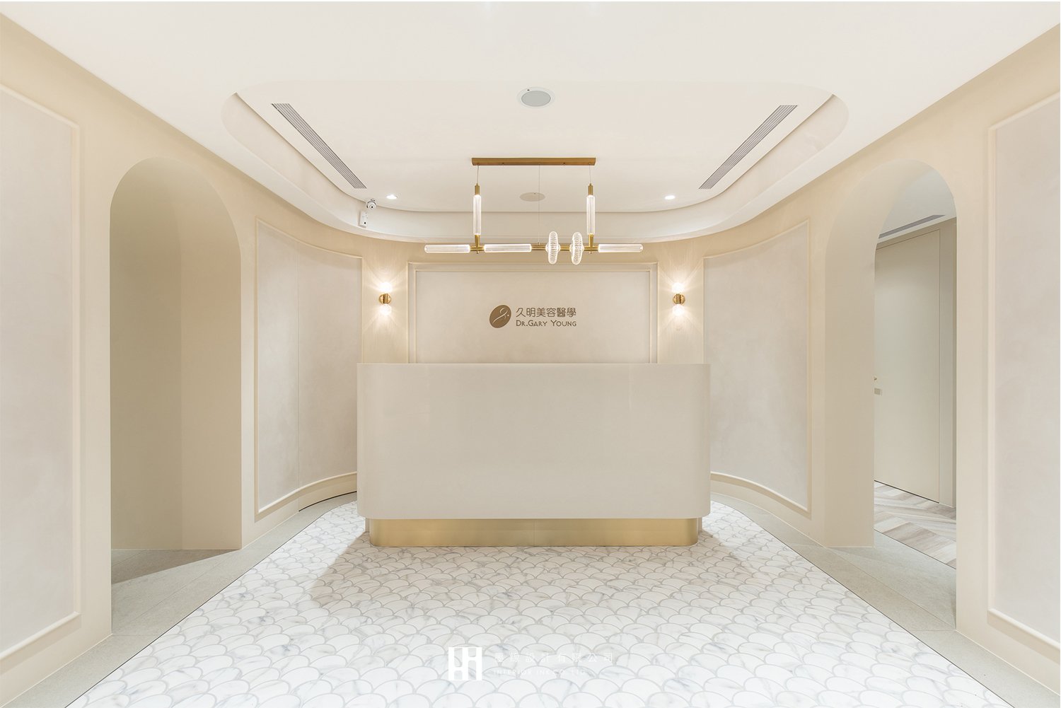
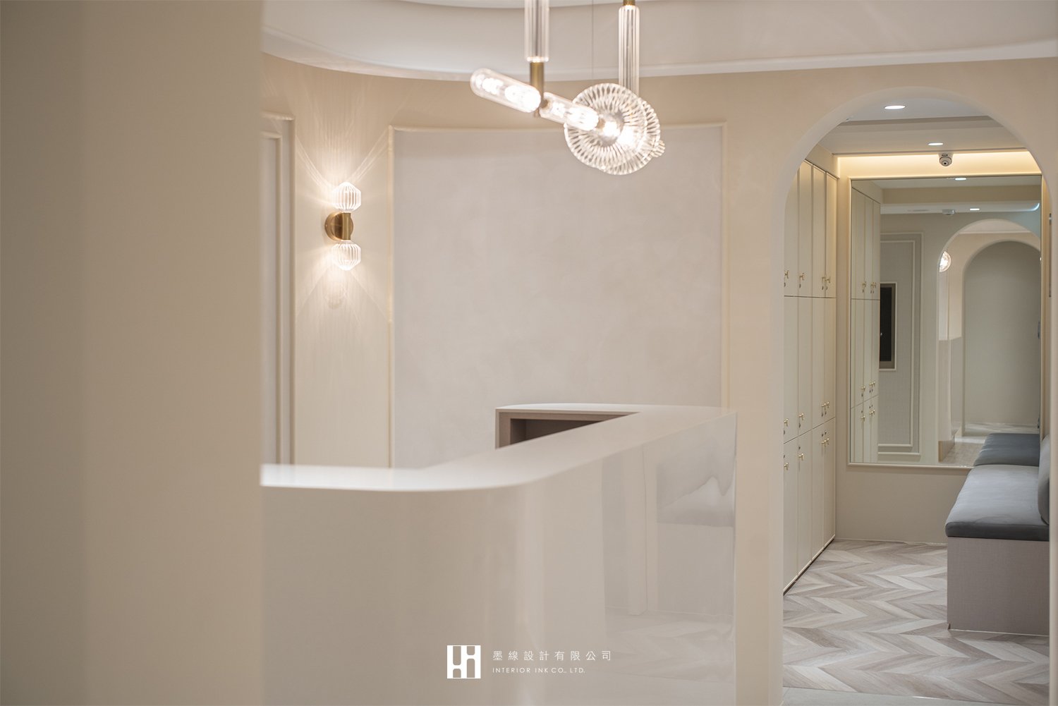
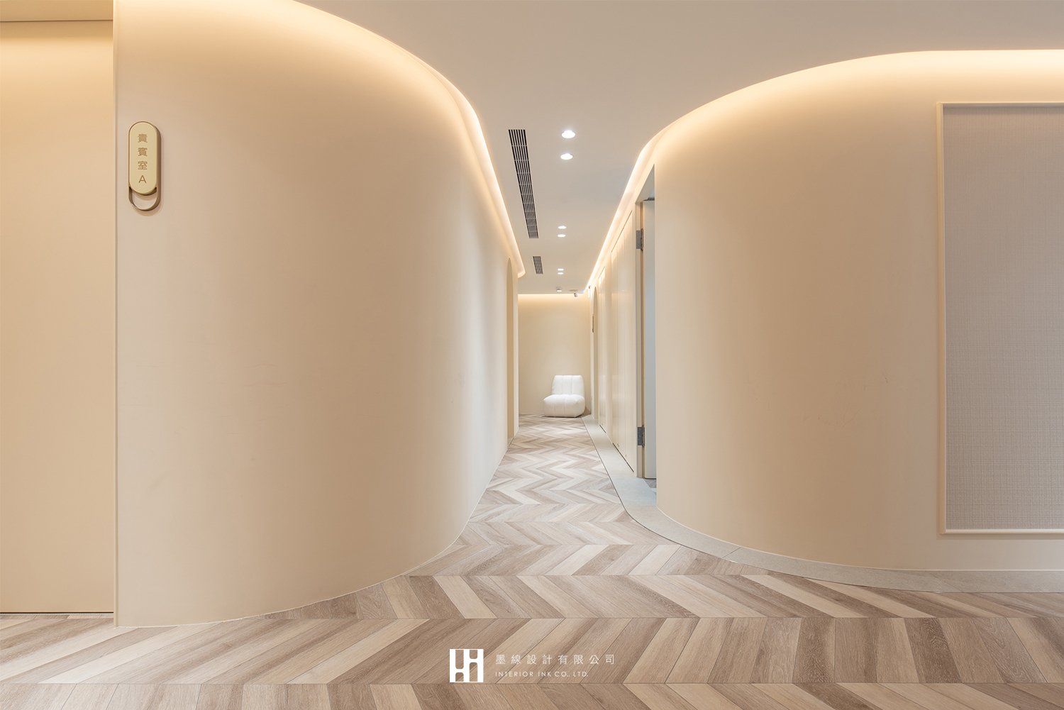
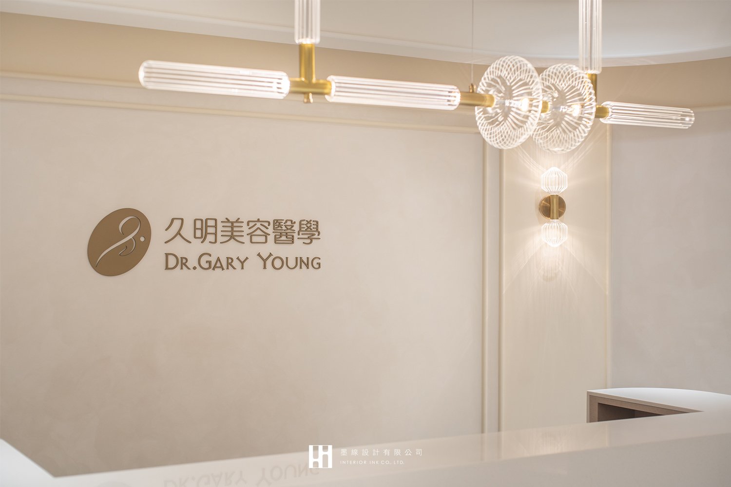
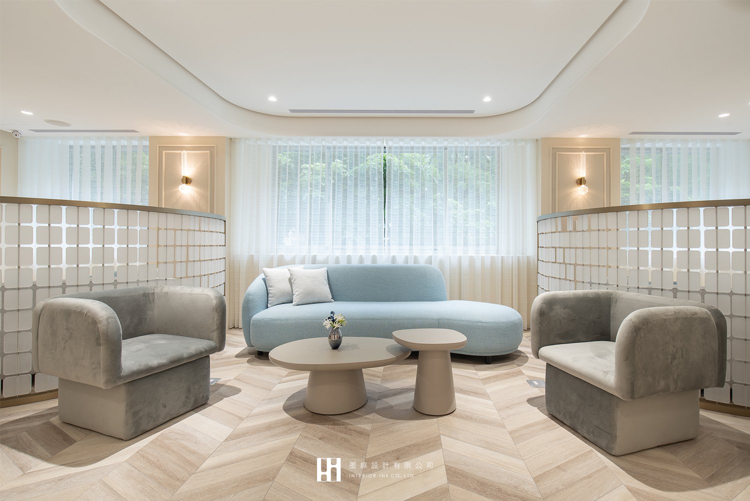
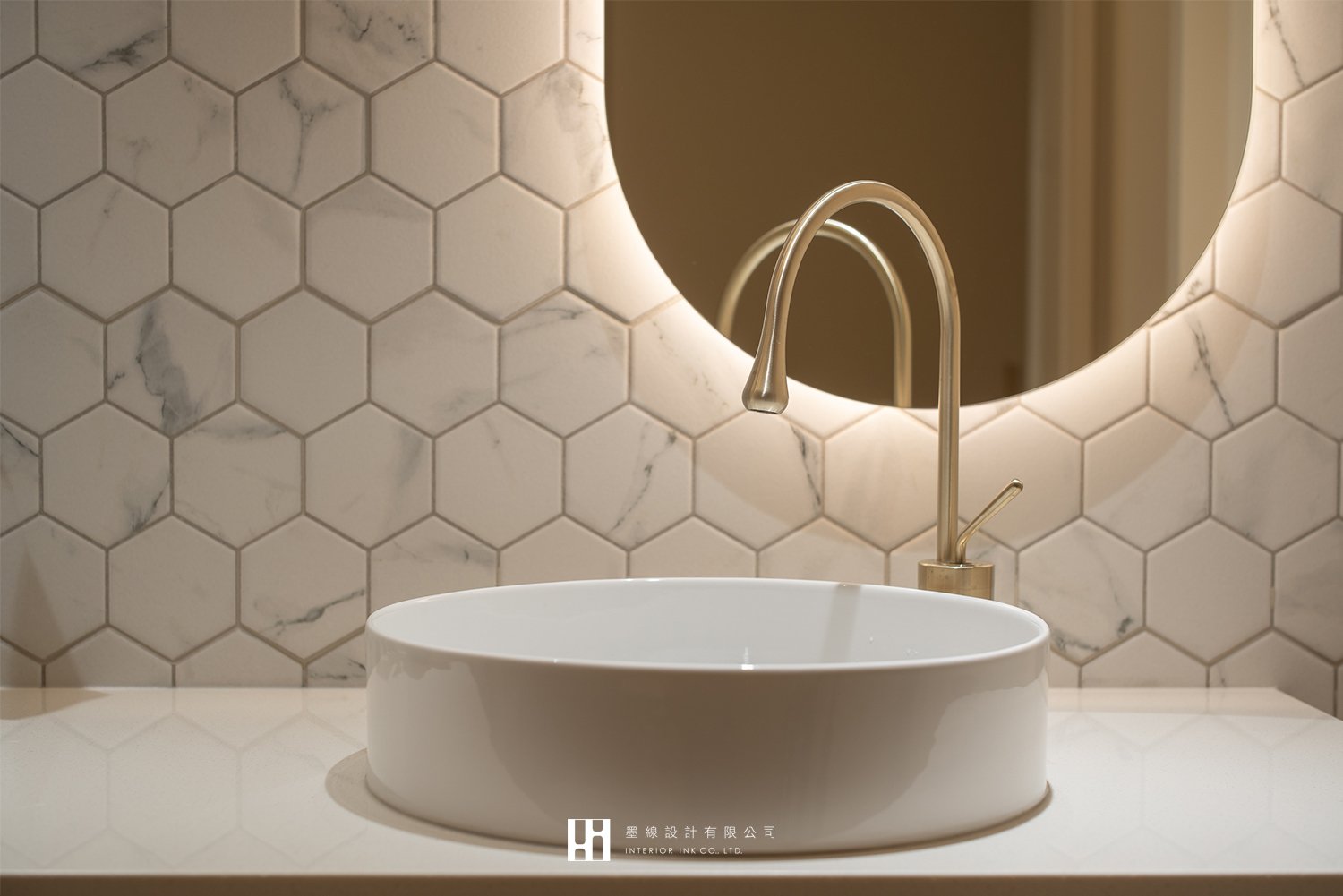
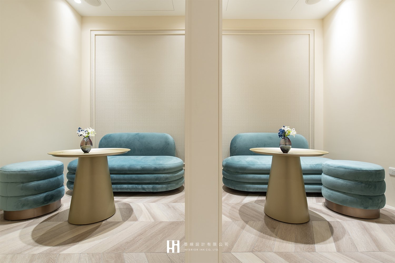
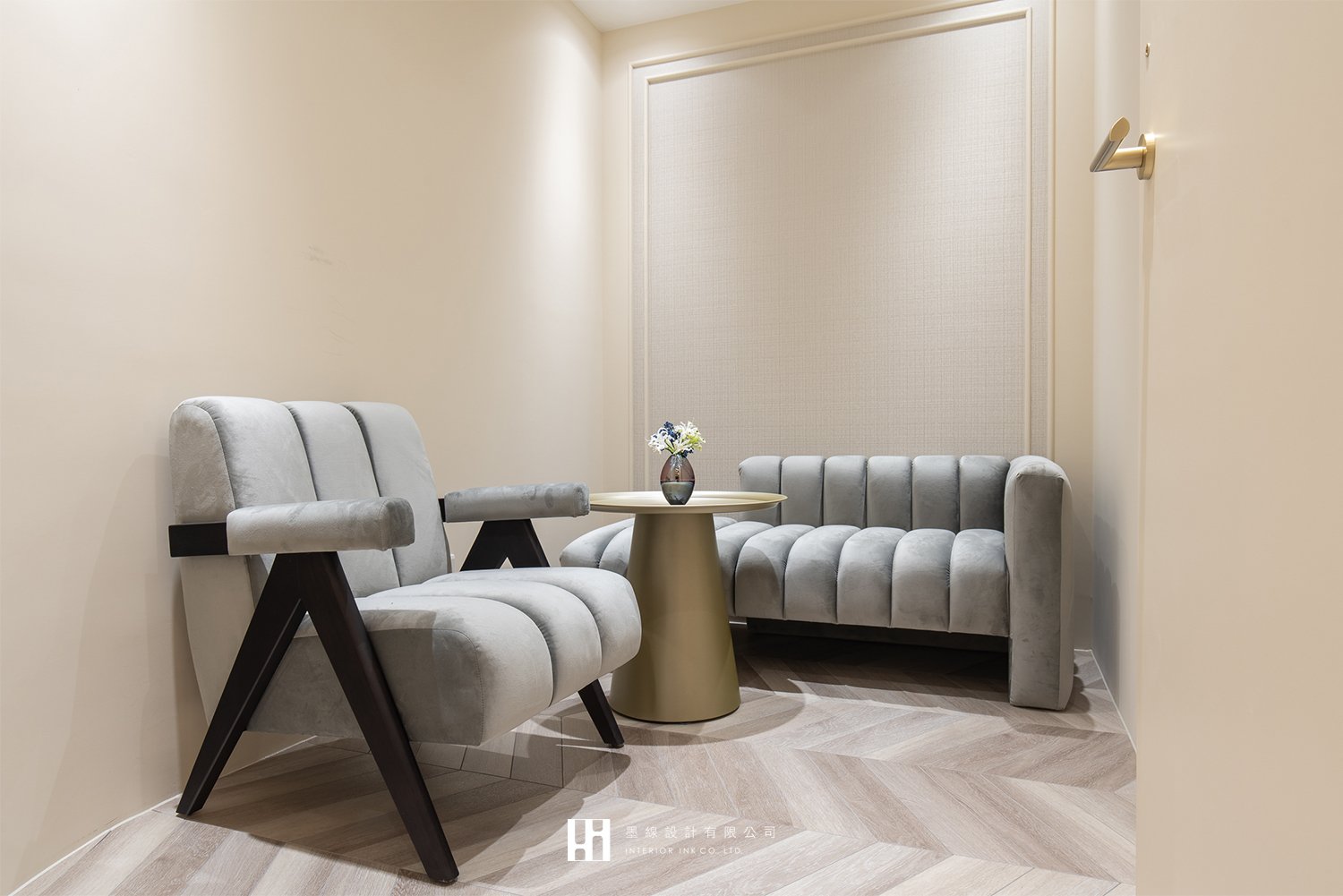
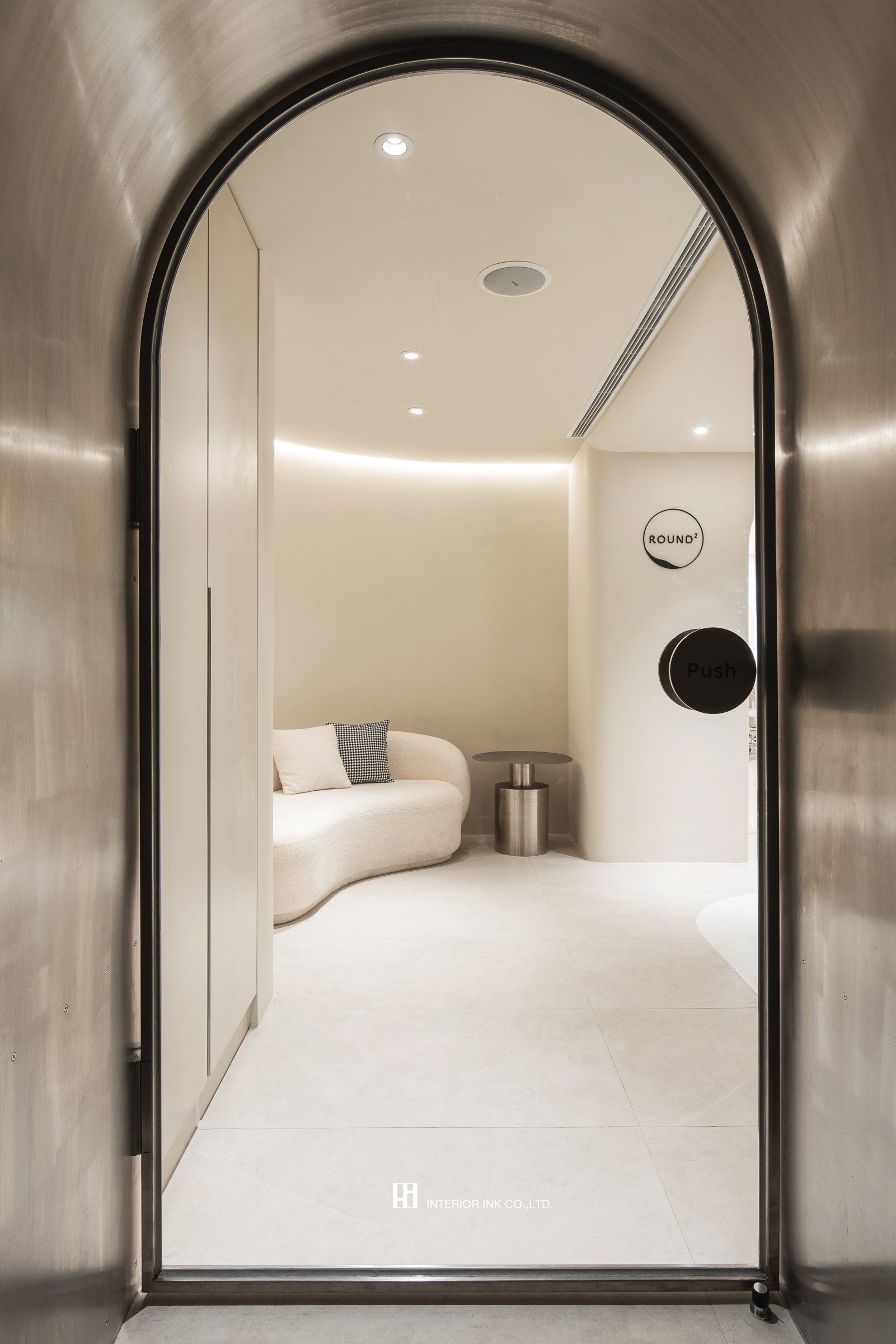
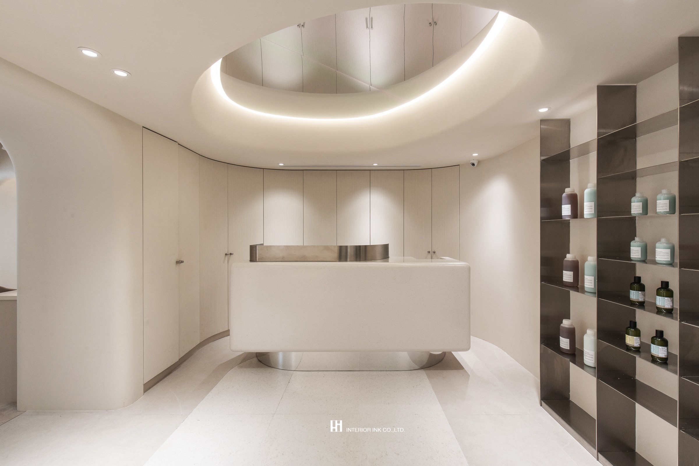
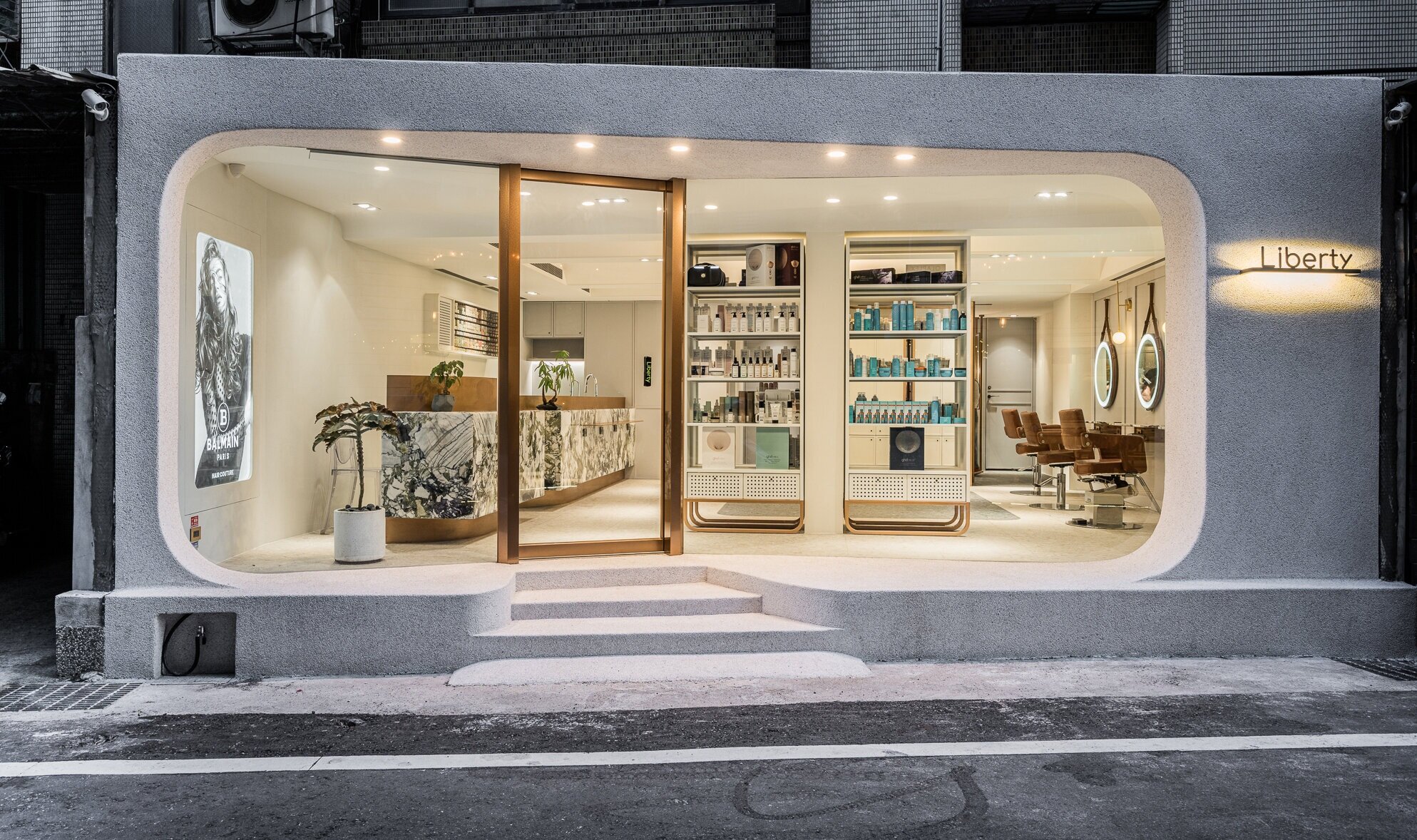
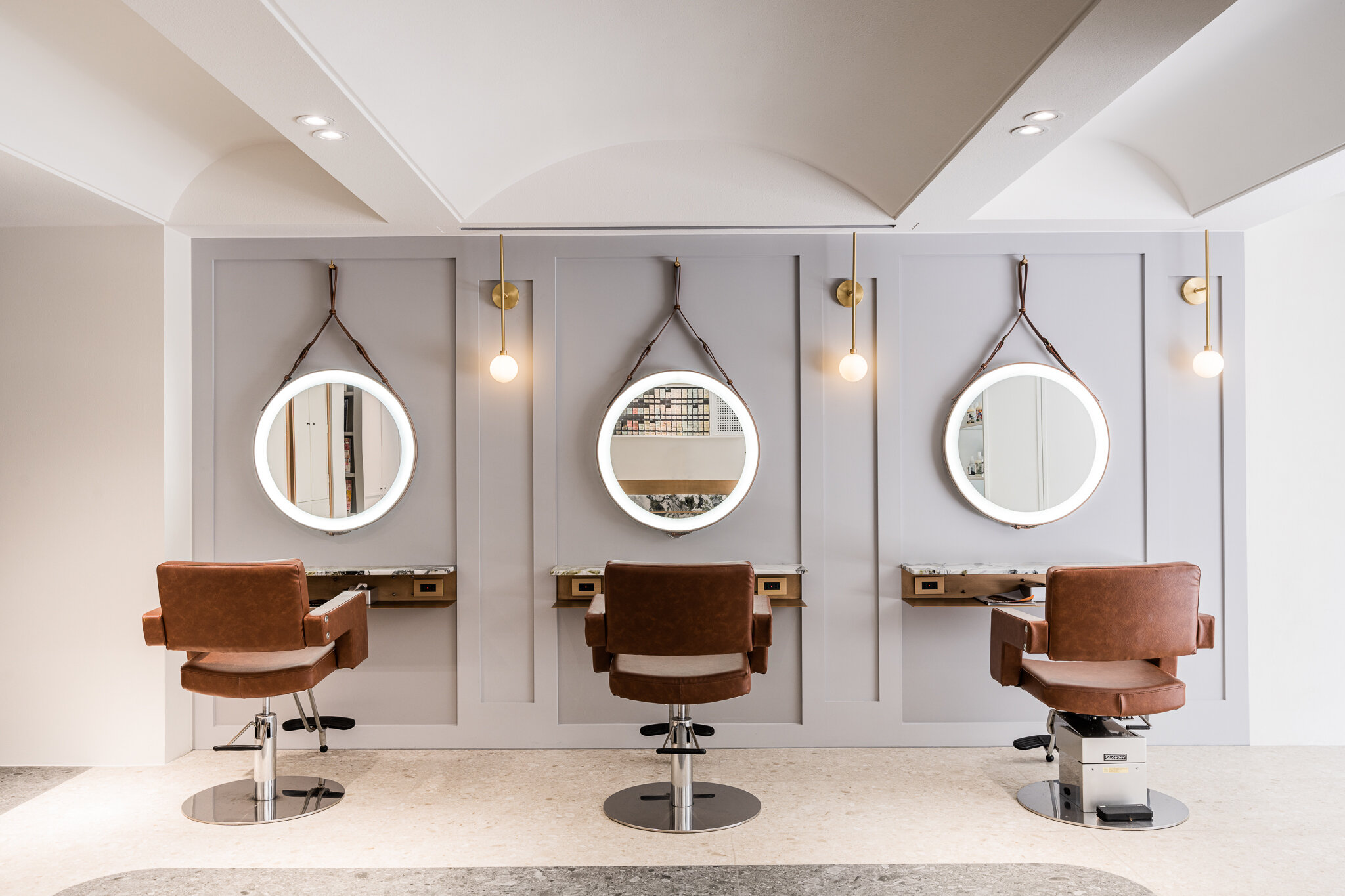
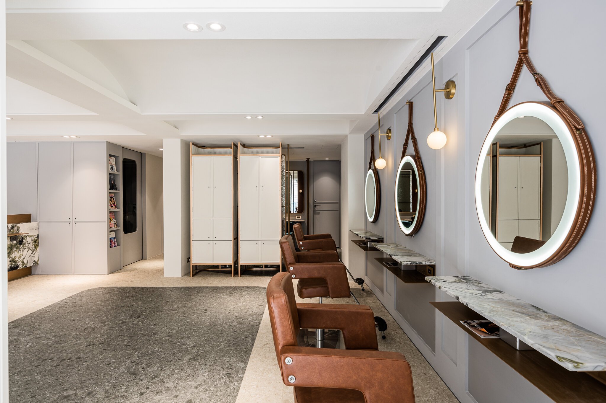
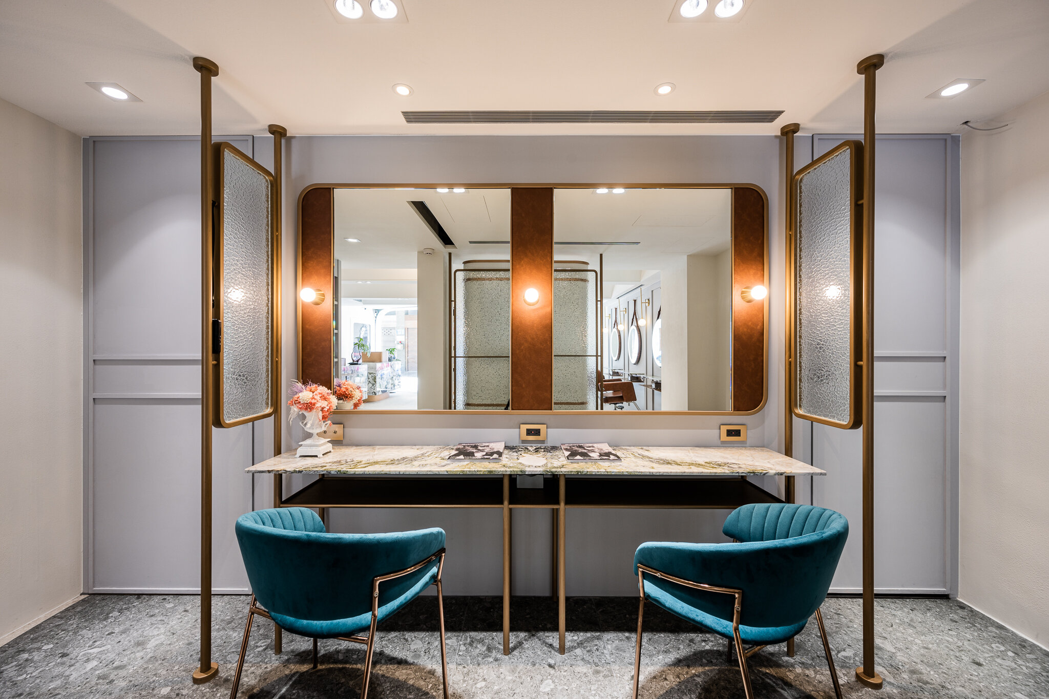
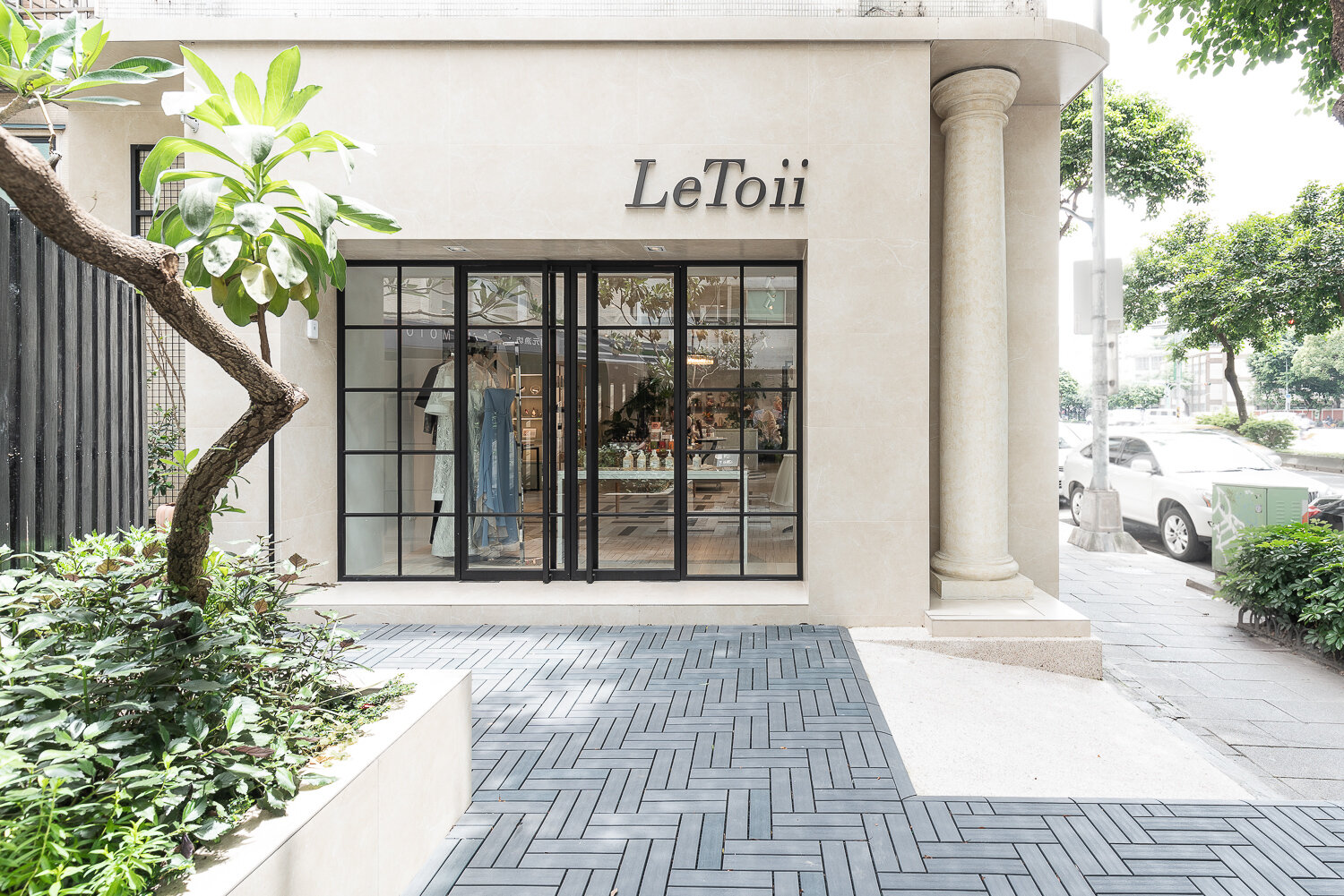
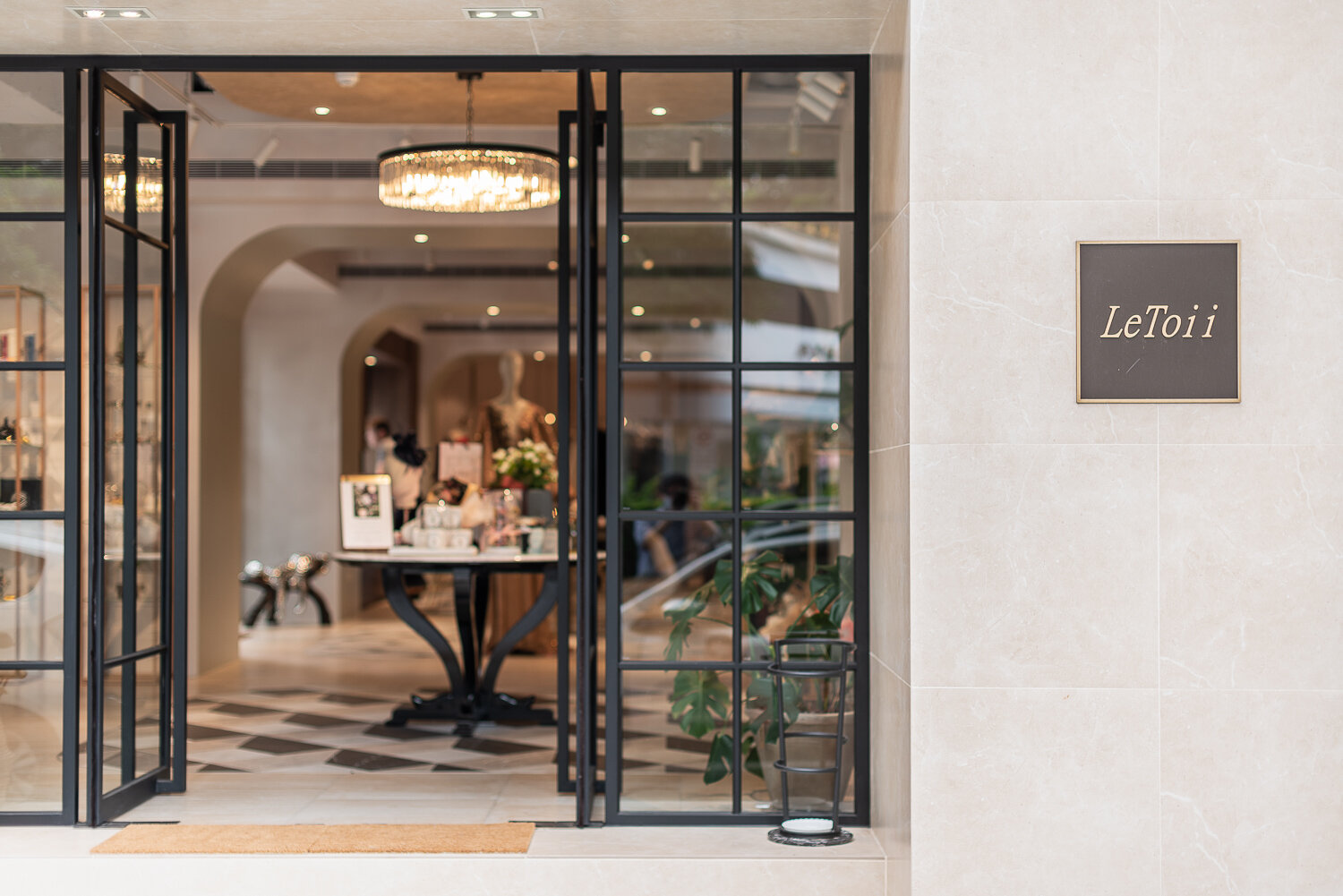
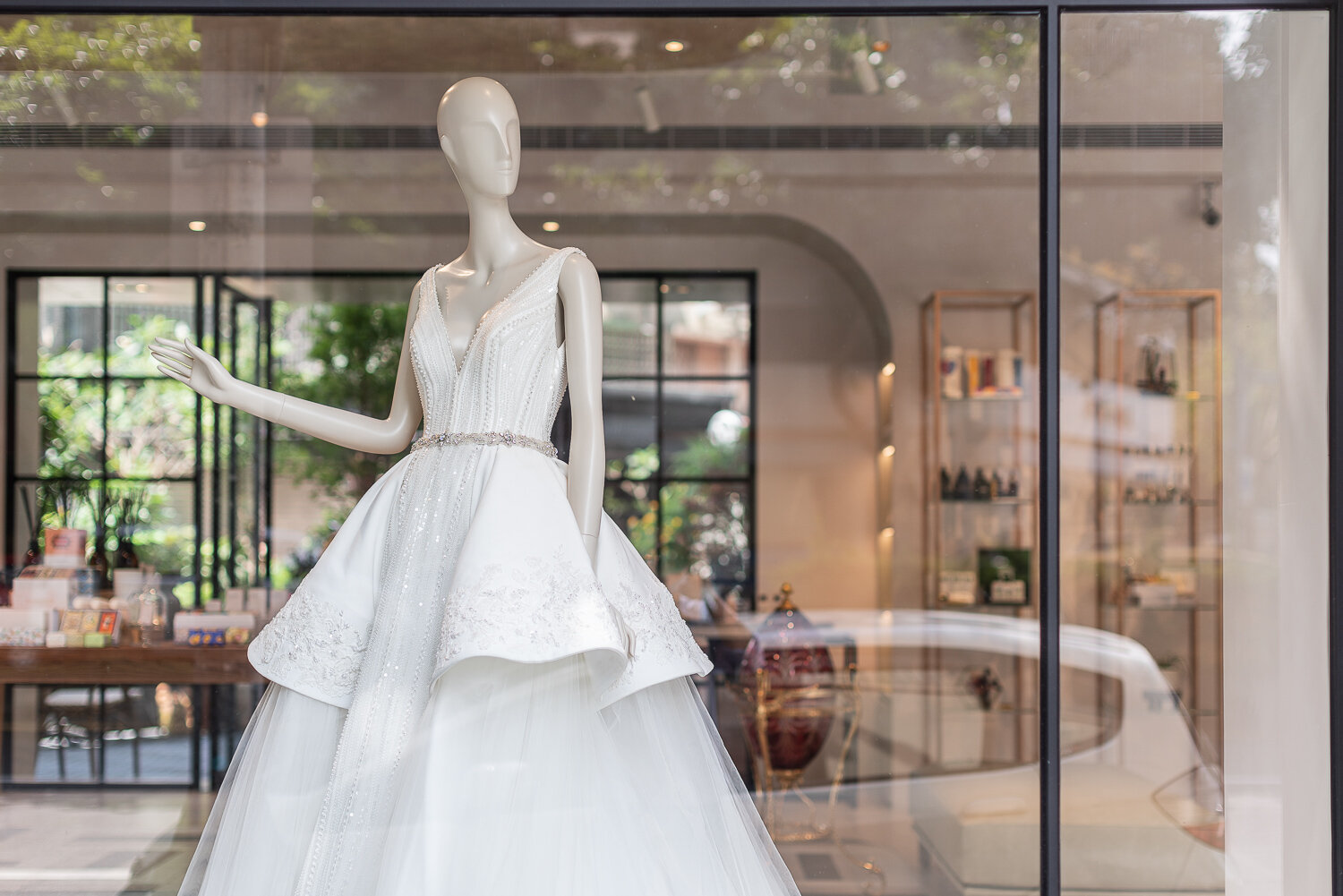
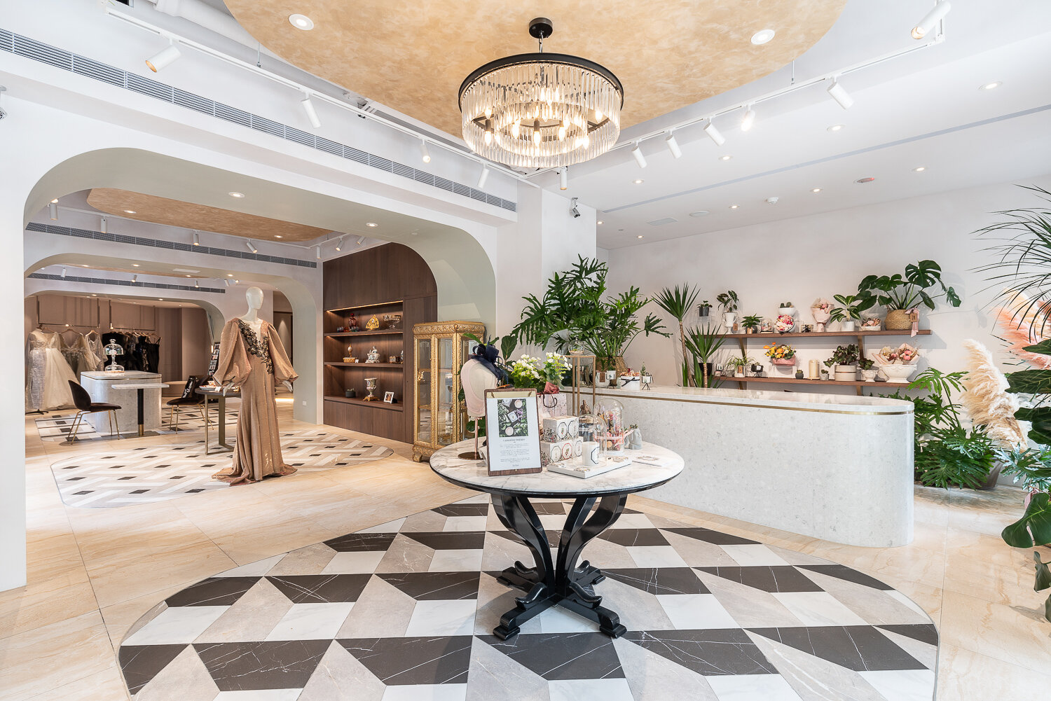
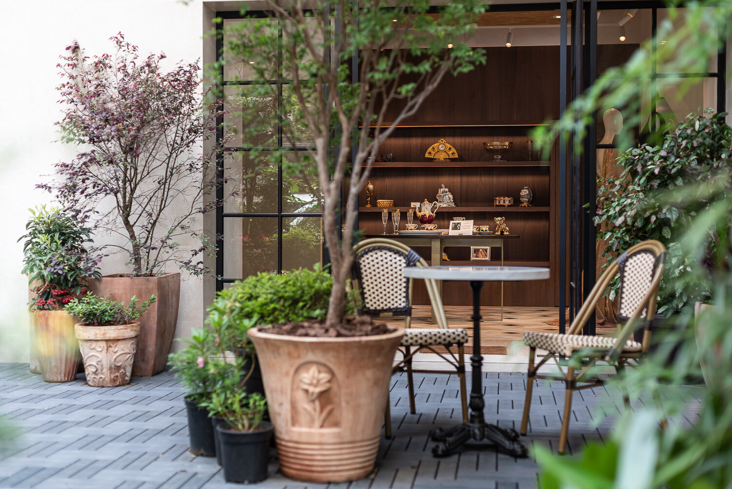
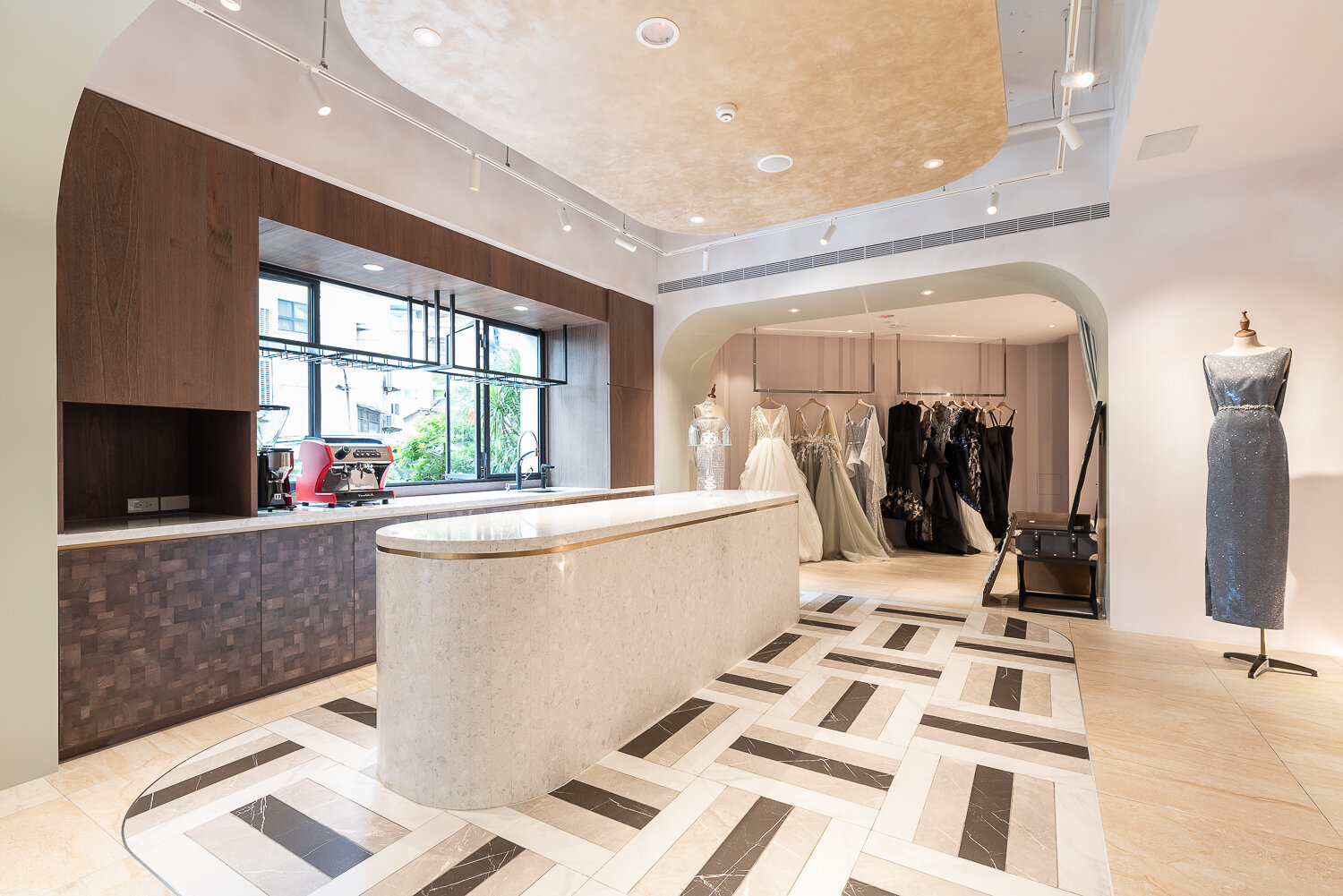
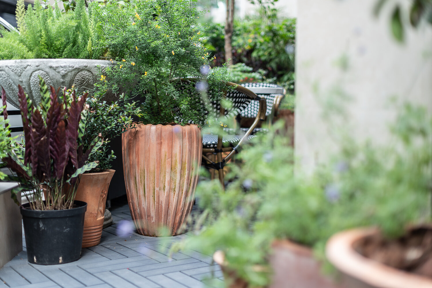
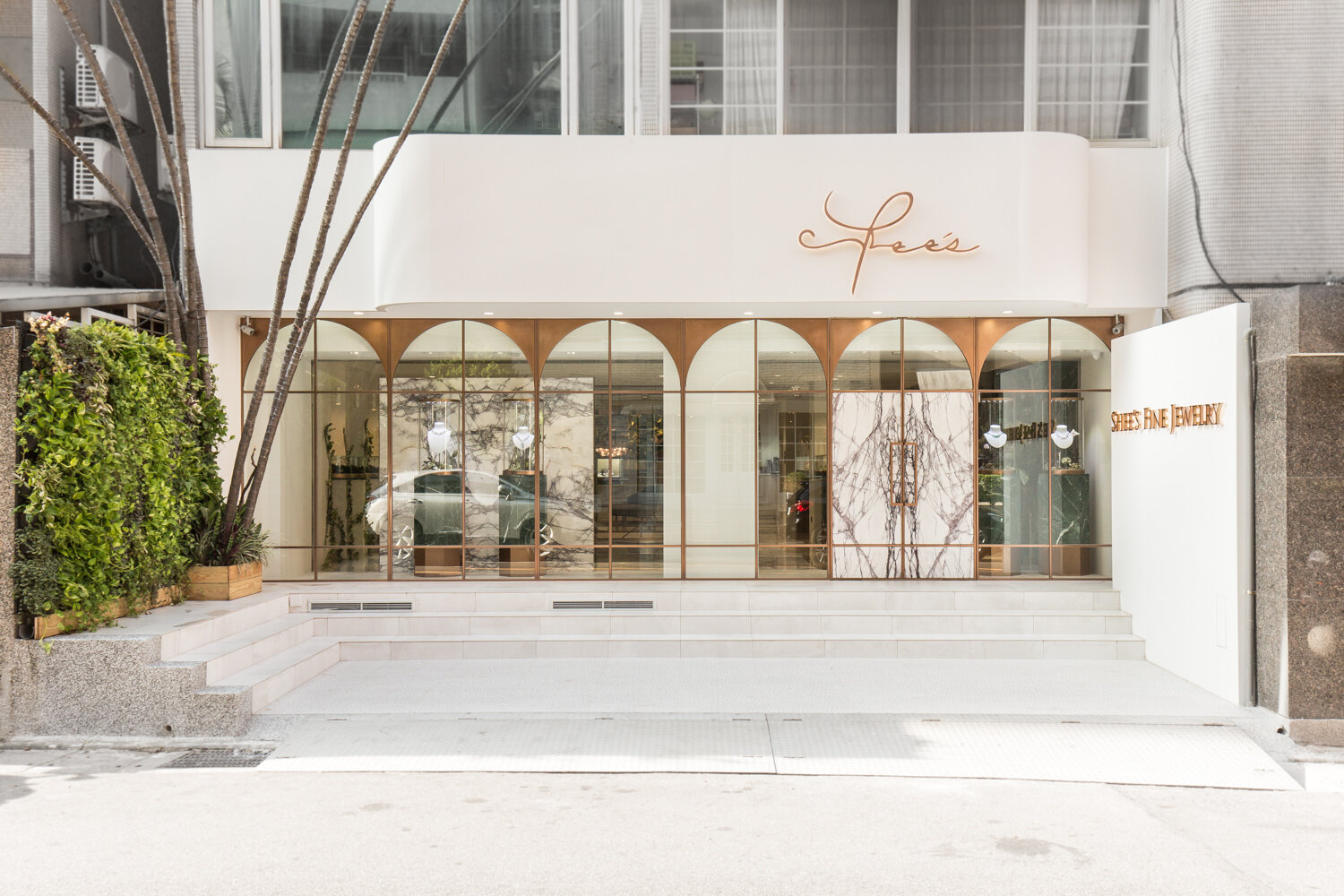
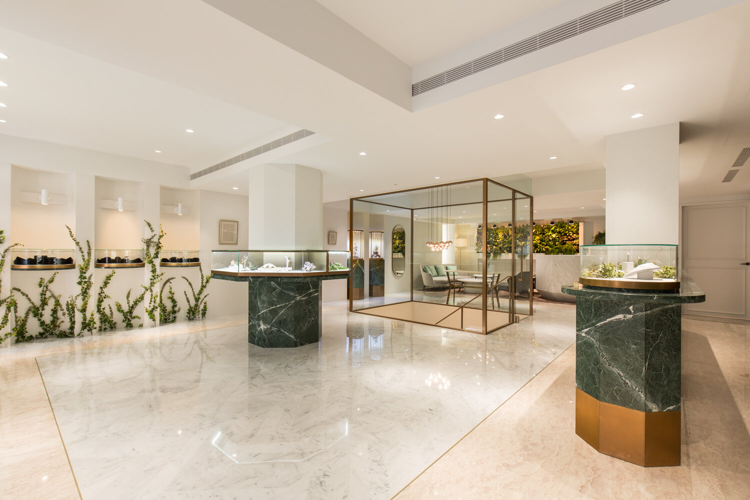
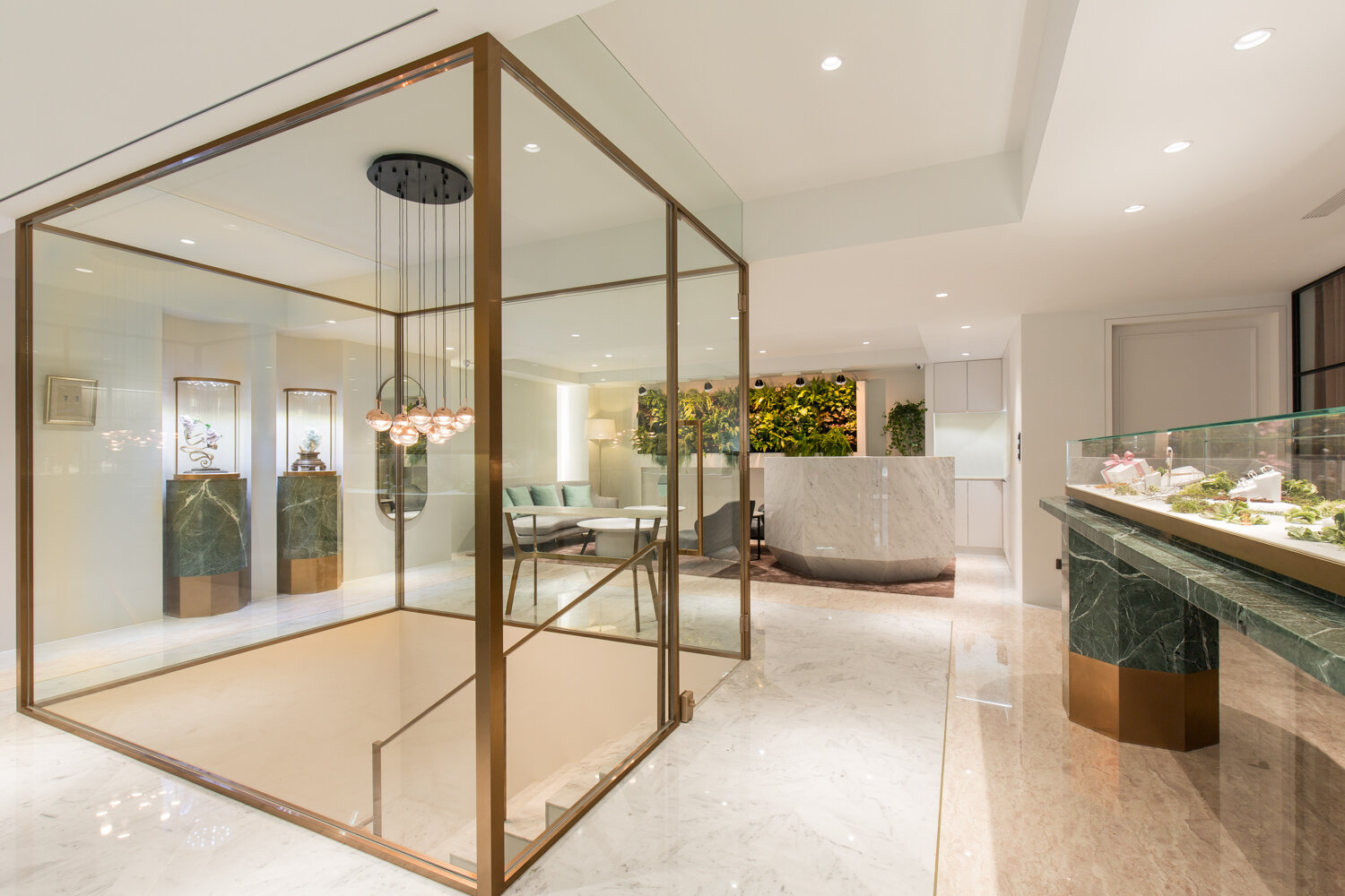
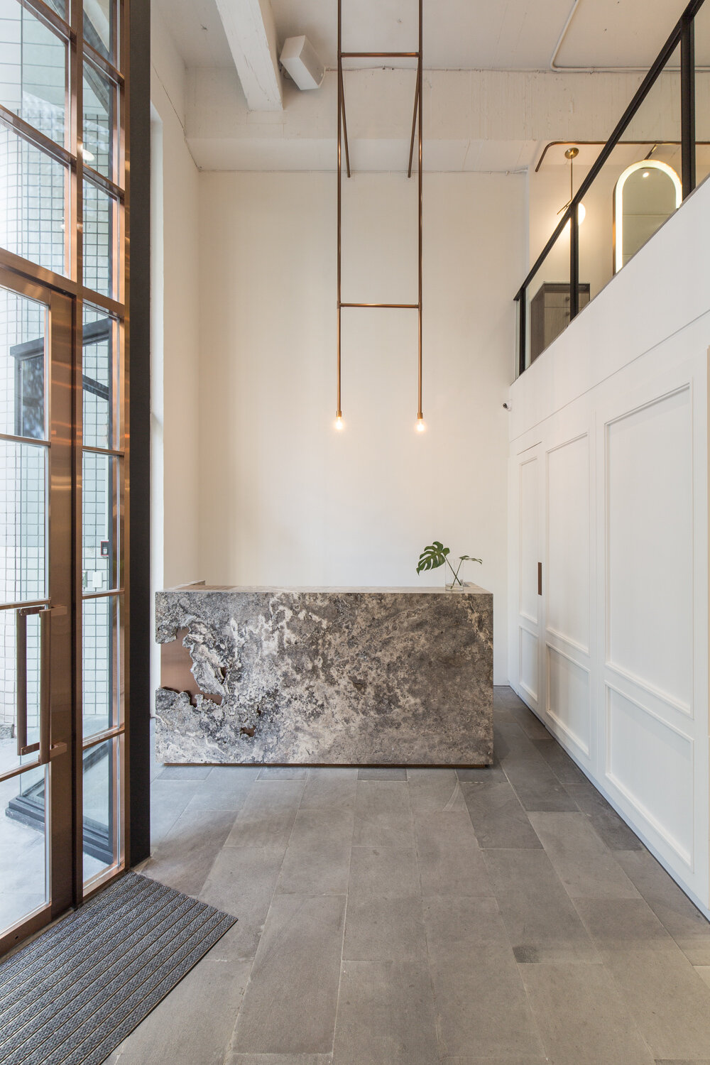
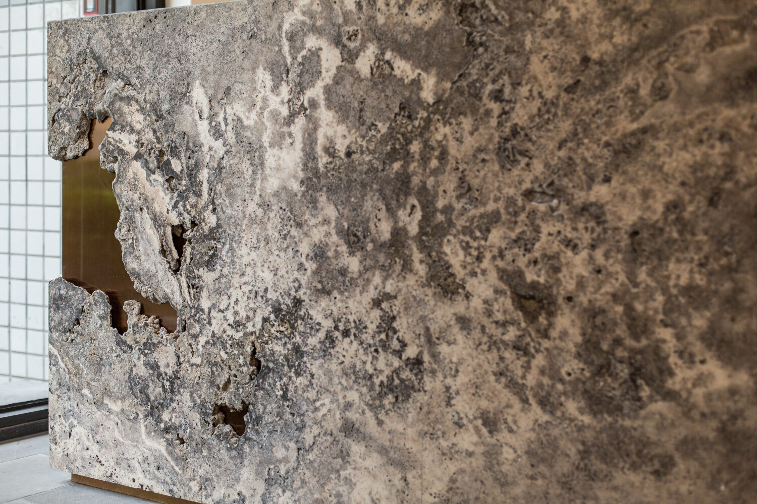
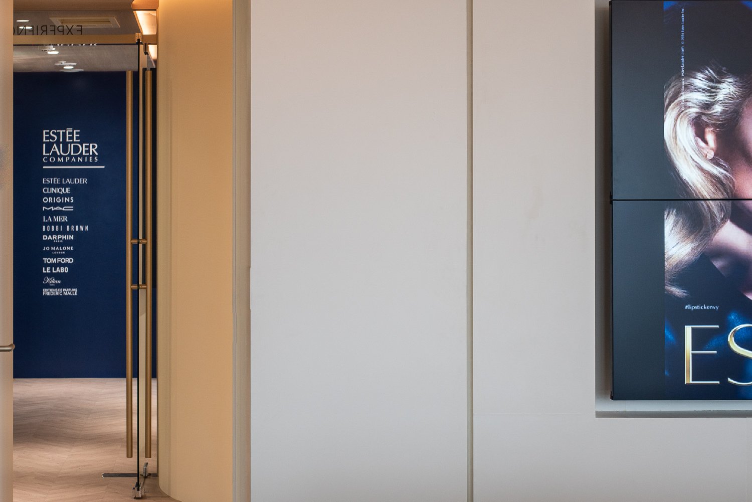
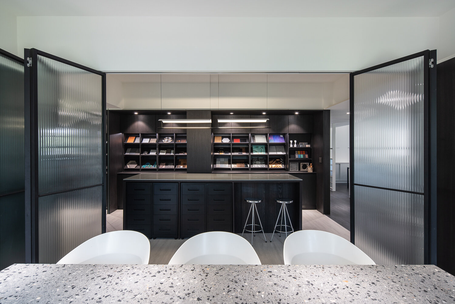
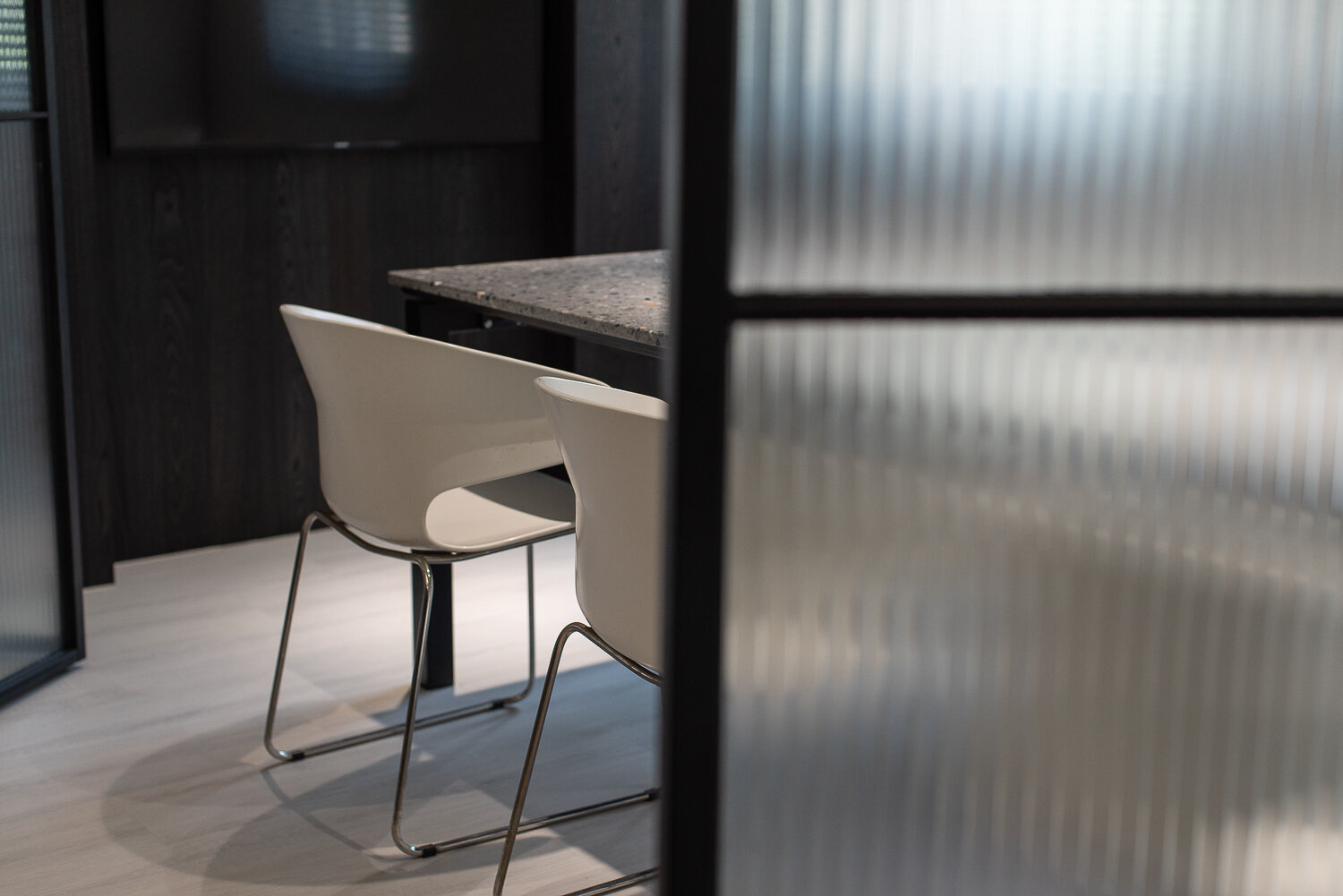
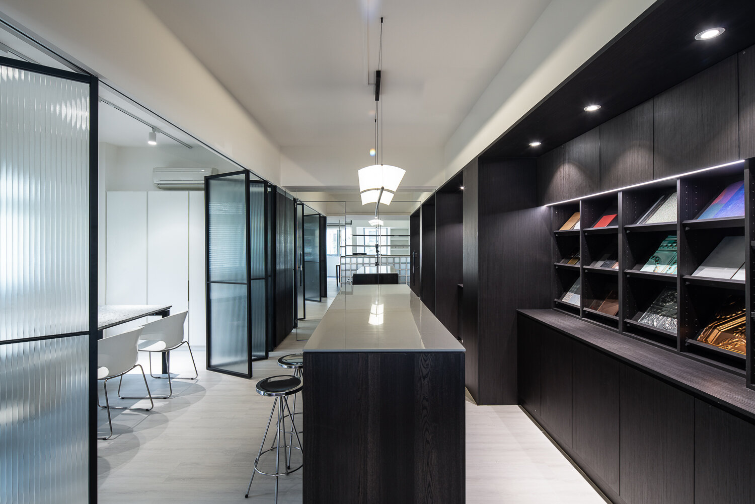
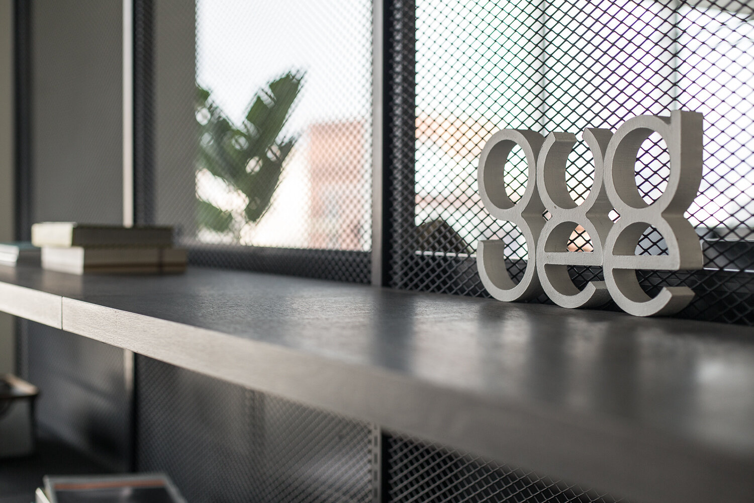
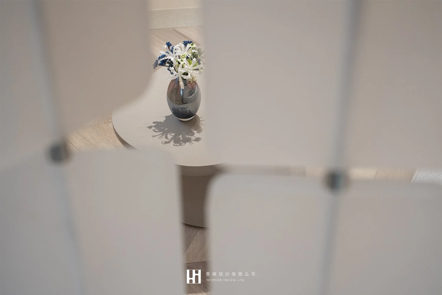
打破邊界、以弧形圓融空間、懈逅輕法式醫學美容 以70%現代風情融合30%法式語彙 弧線元素串聯,從門面、天花、牆體,由外延伸室內, 整體以乾淨的奶油色與白色為主色,搭配大地色系與藍灰色彩, 並以石材、皮革、鍍鈦材質以及特殊進口壁布貫穿空間展現浪漫質感細節。 尋光而行 煥發細節之美~

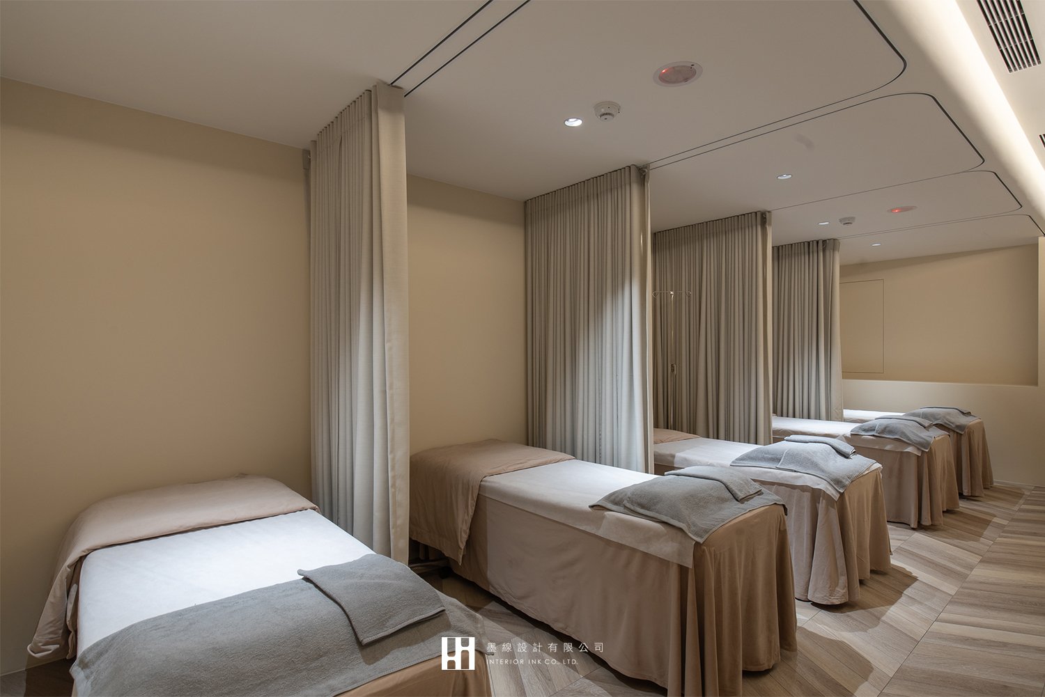
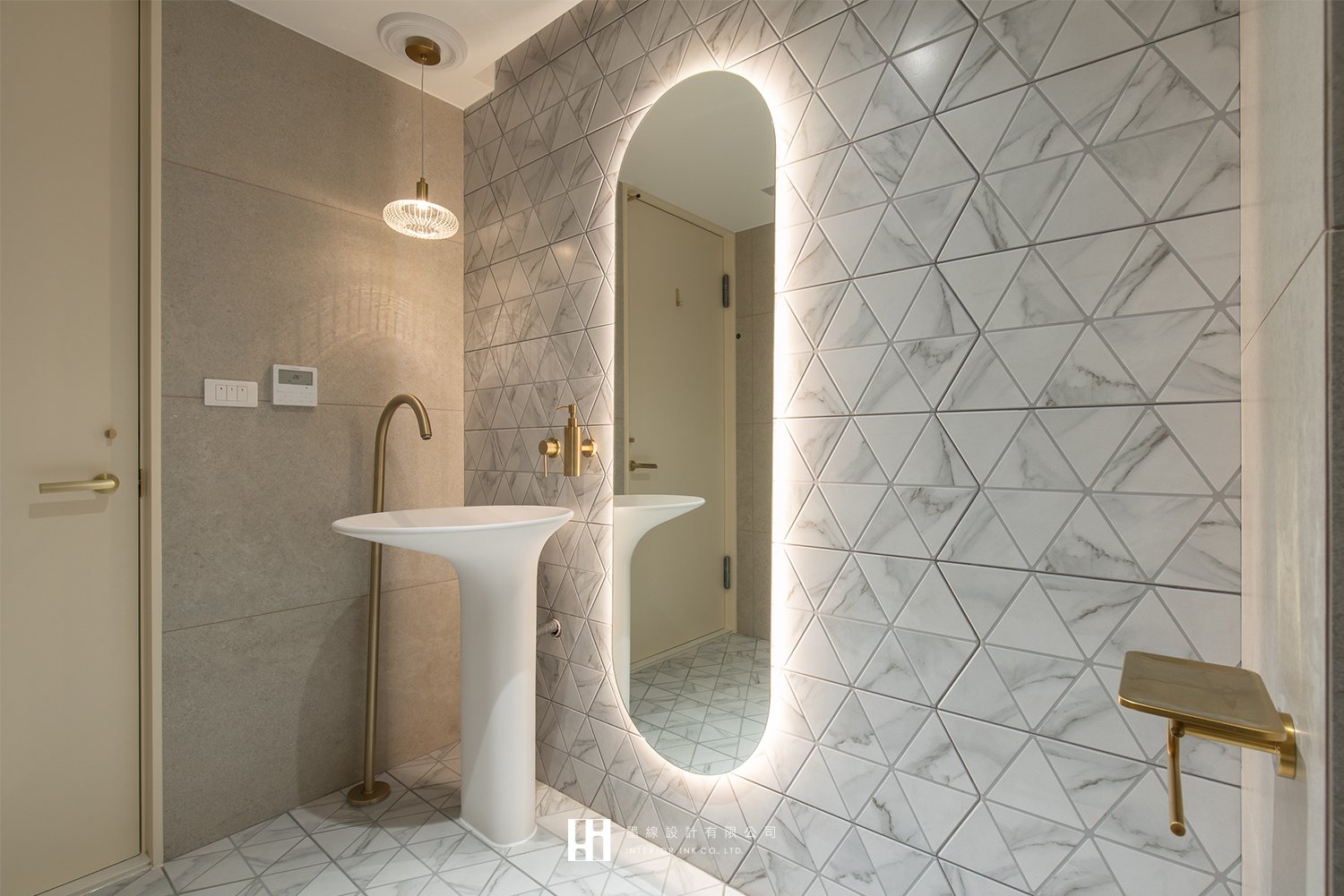
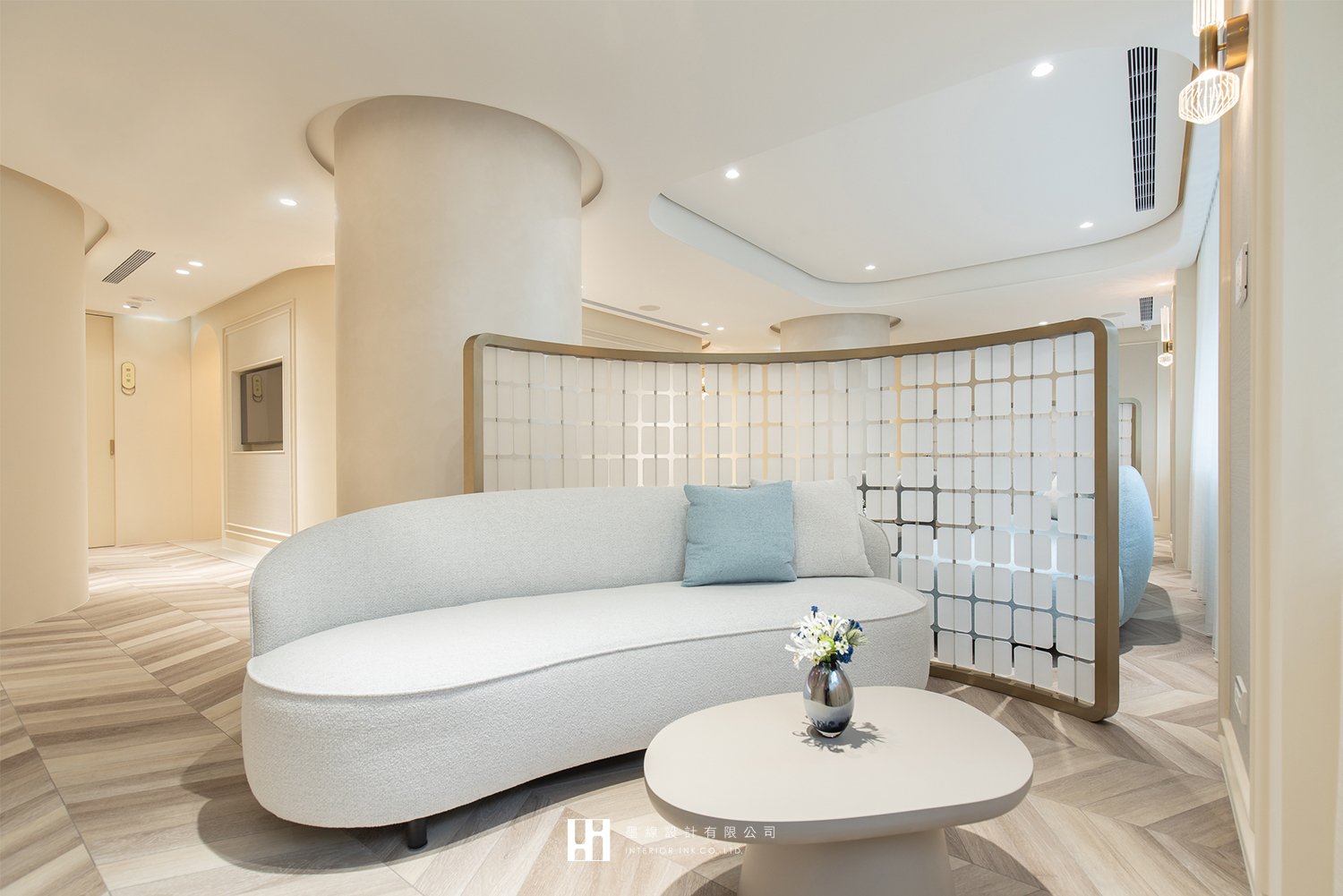
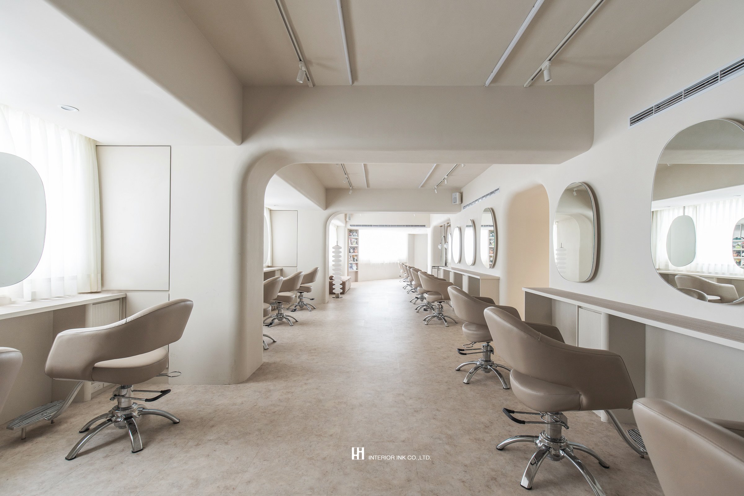
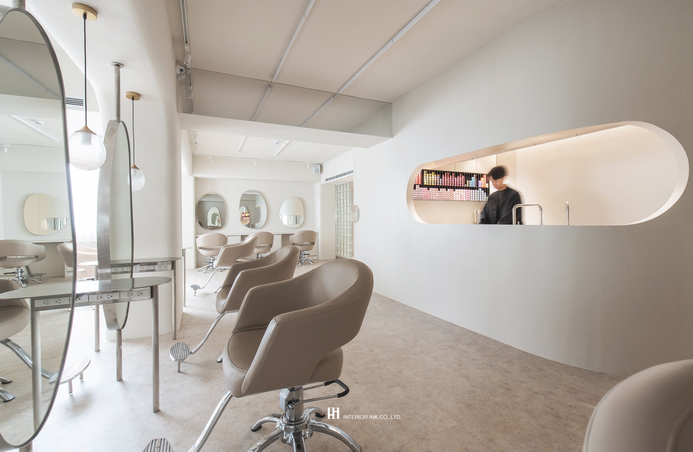
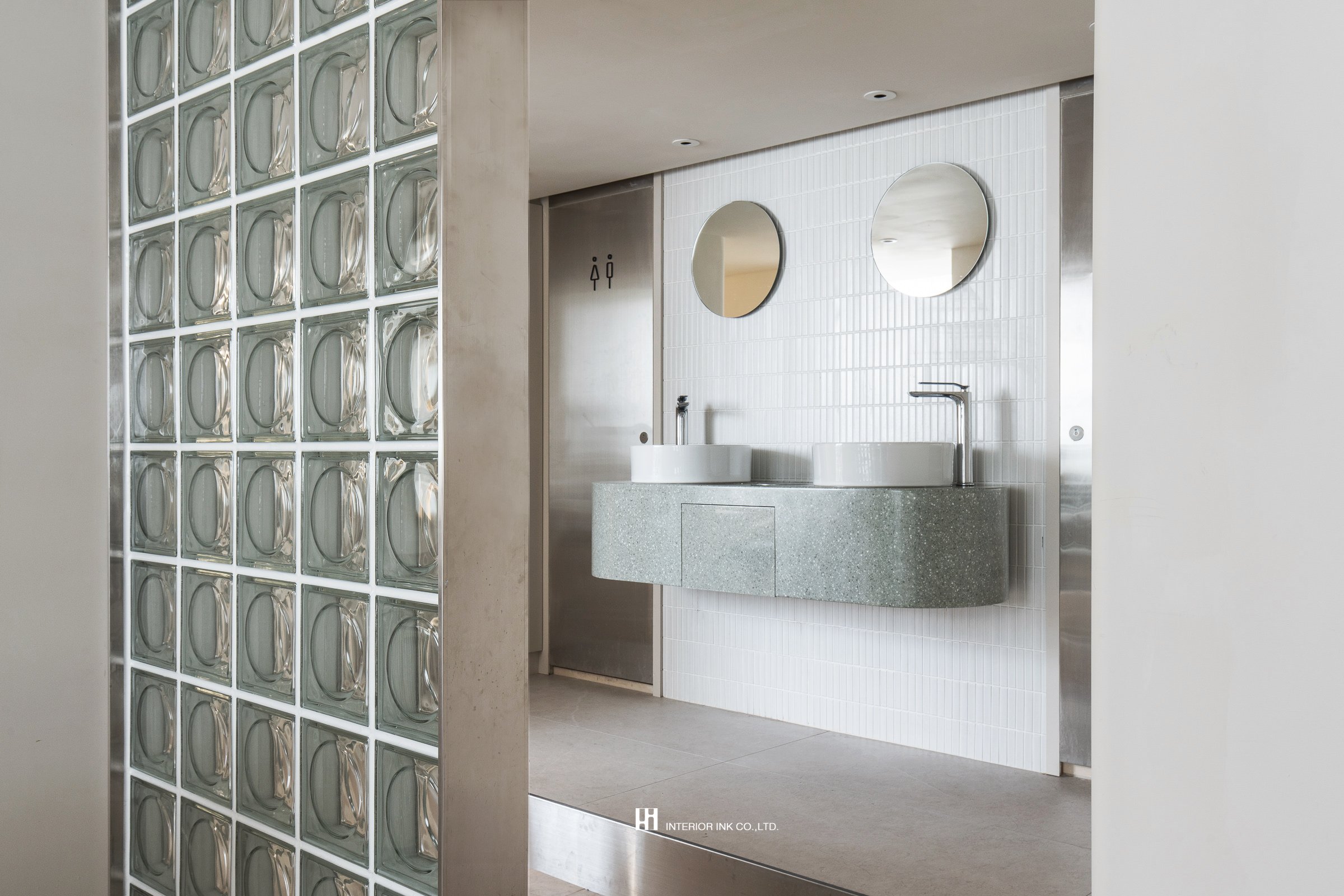
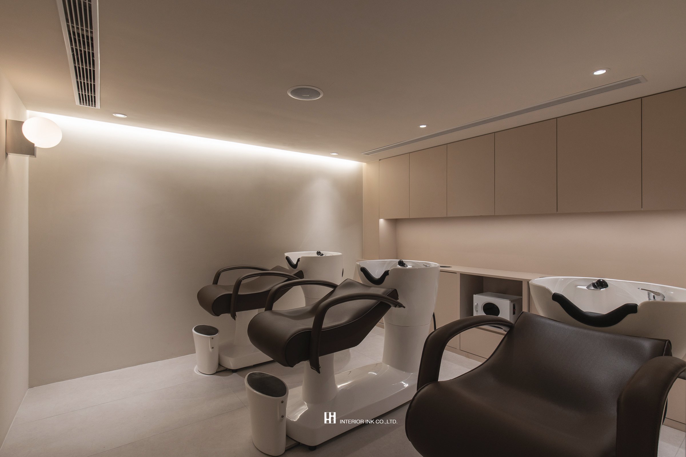
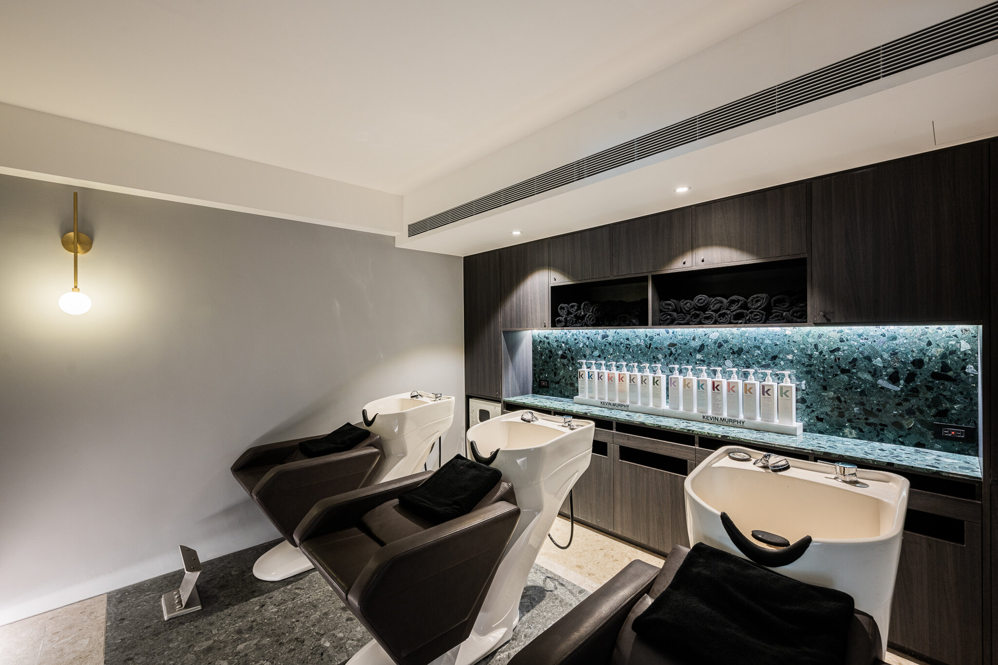
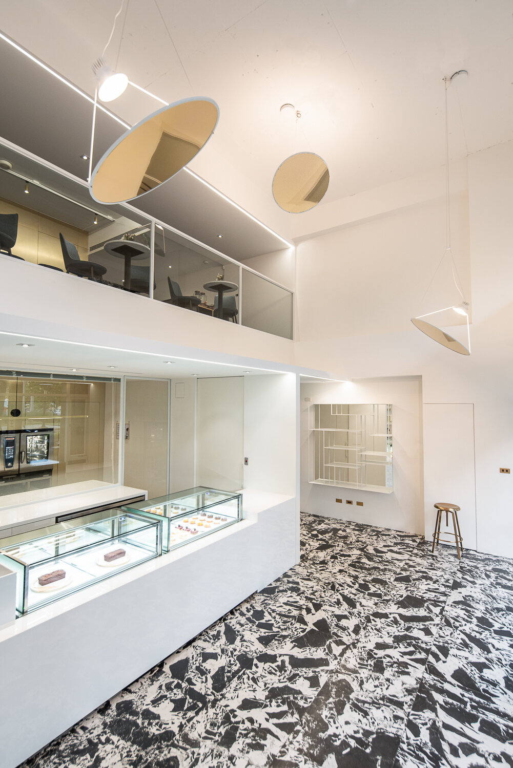
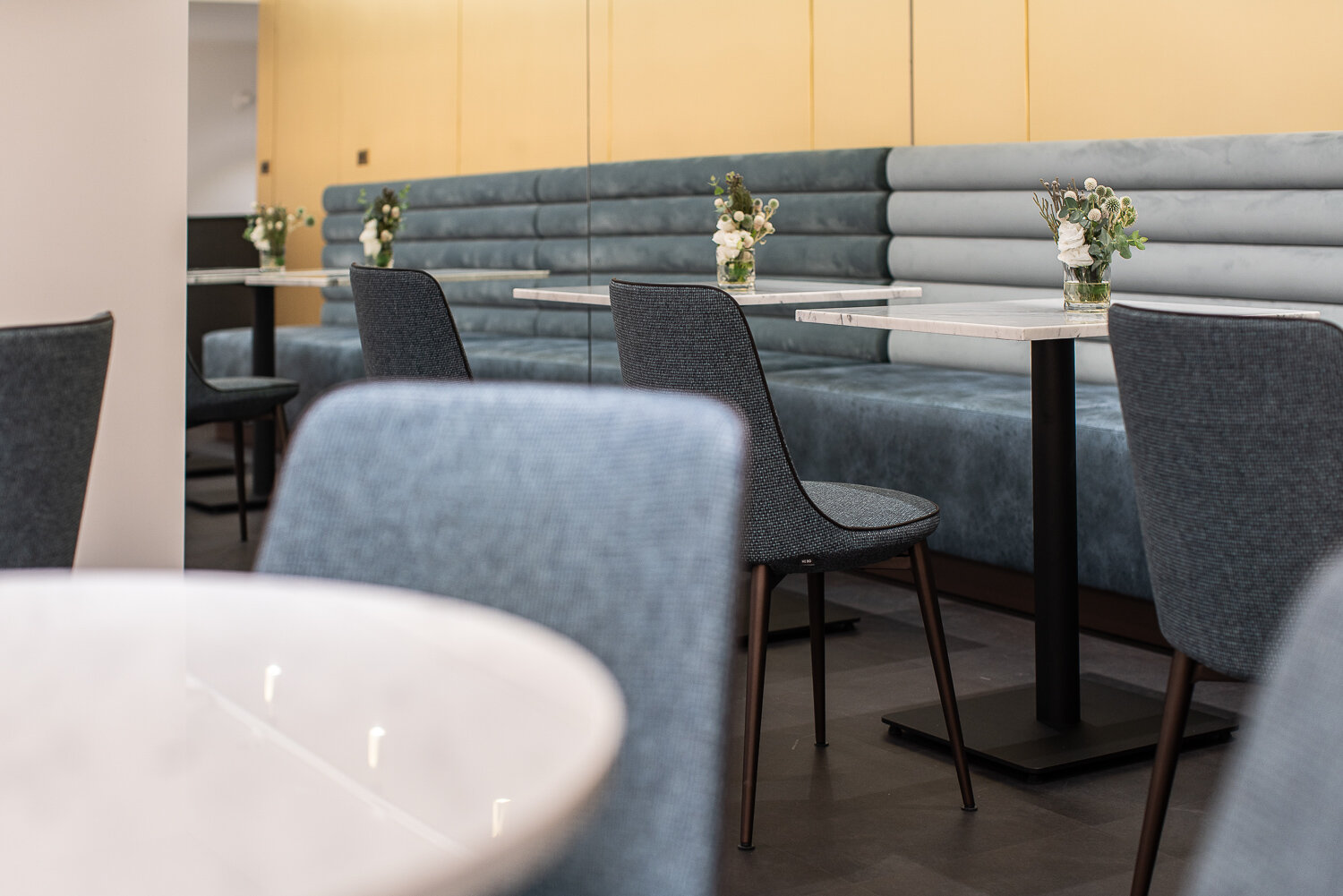
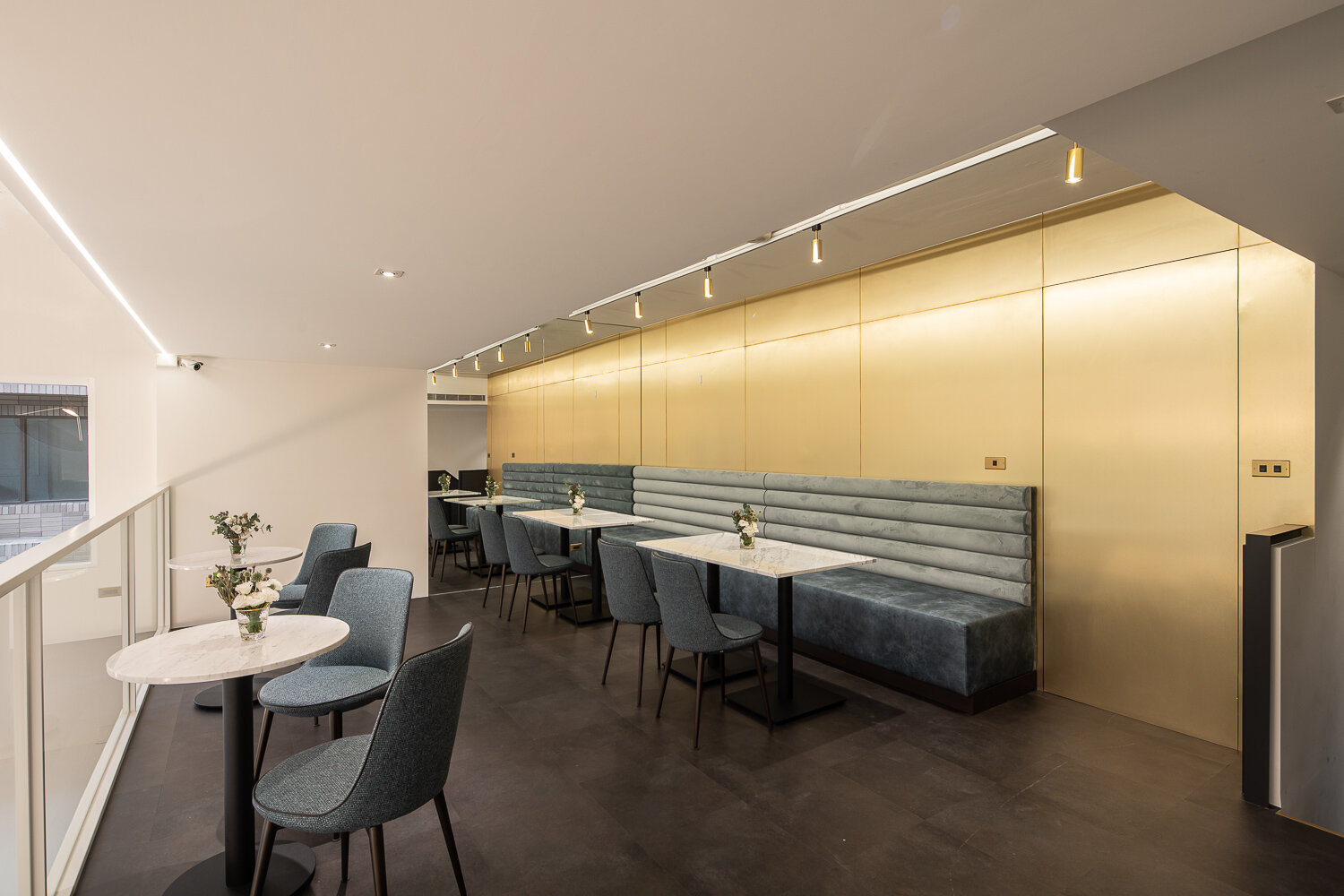
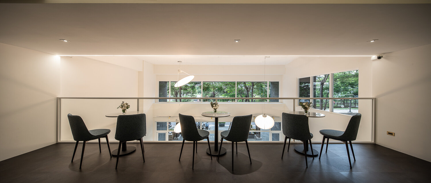
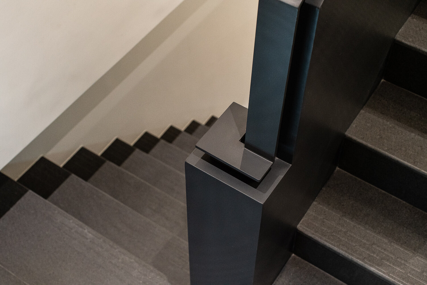
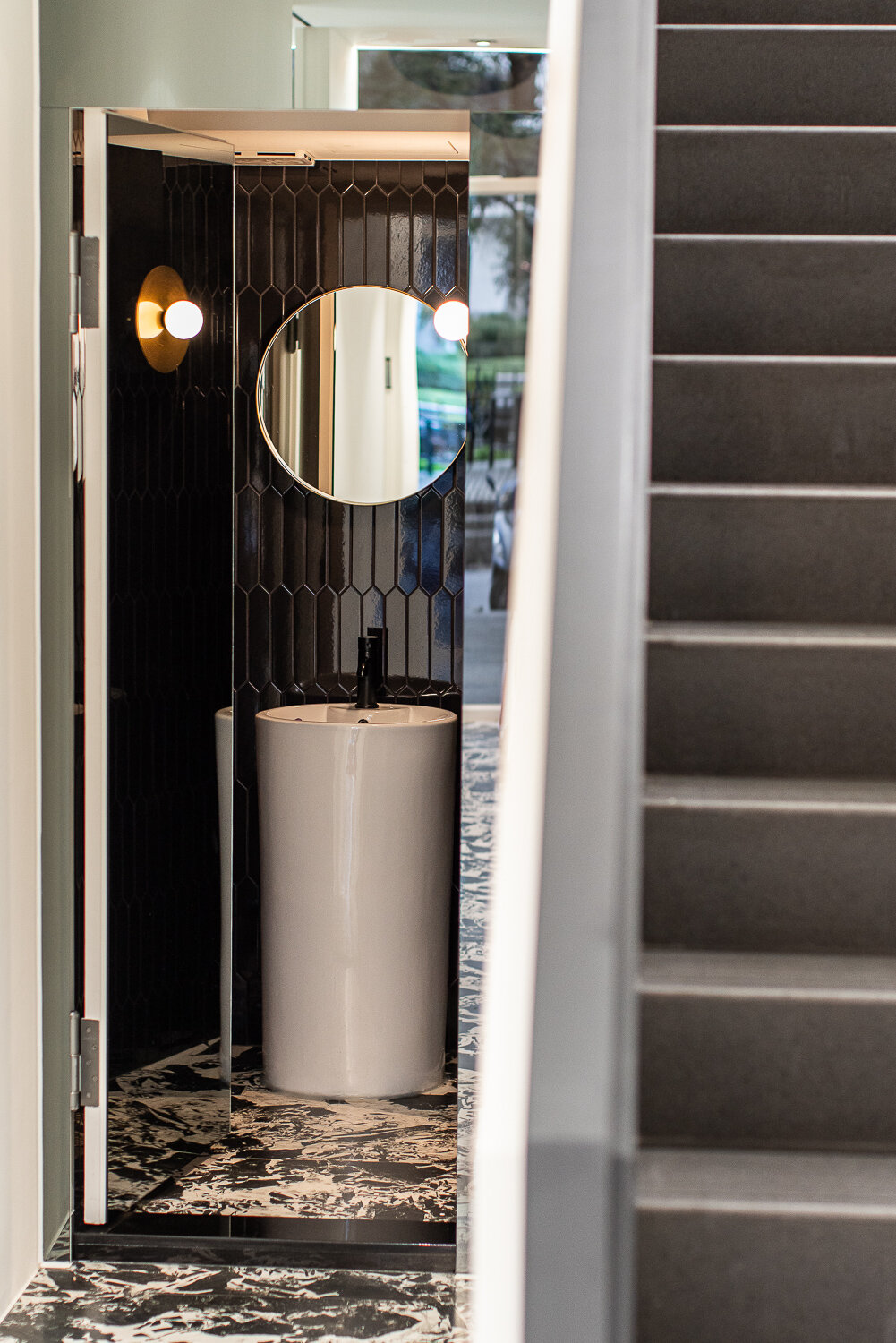
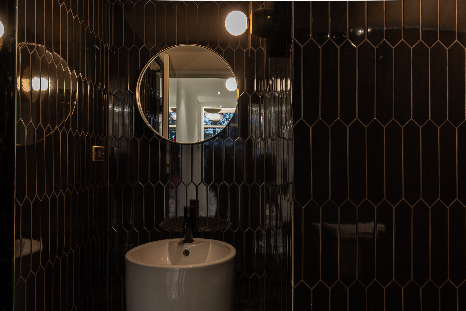
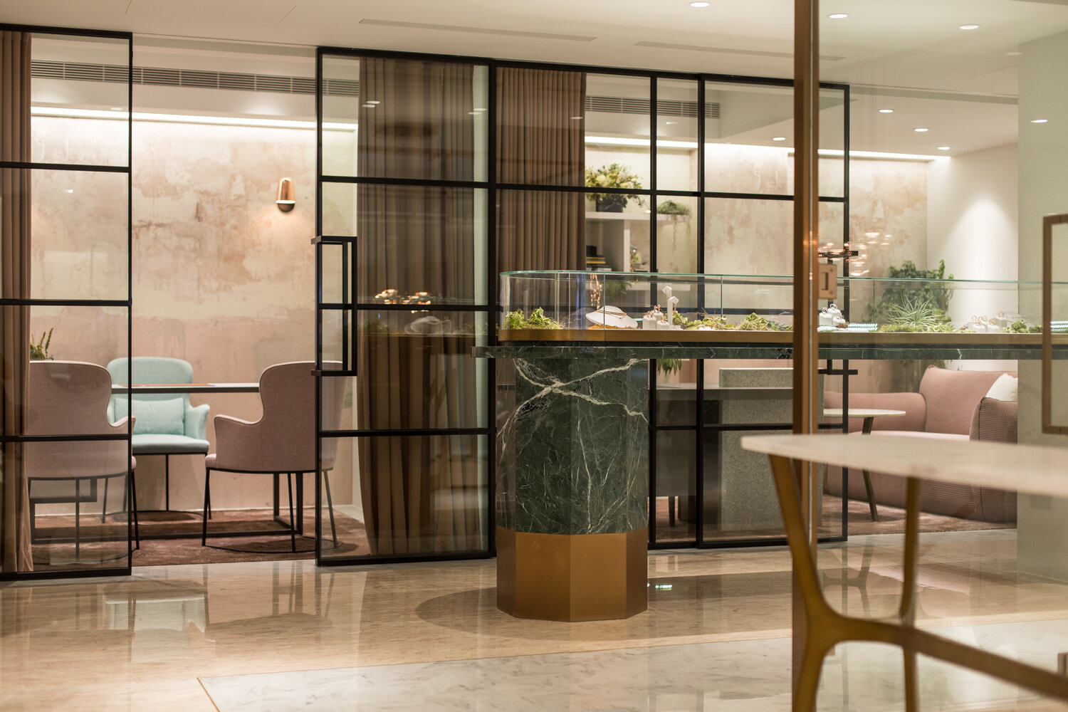
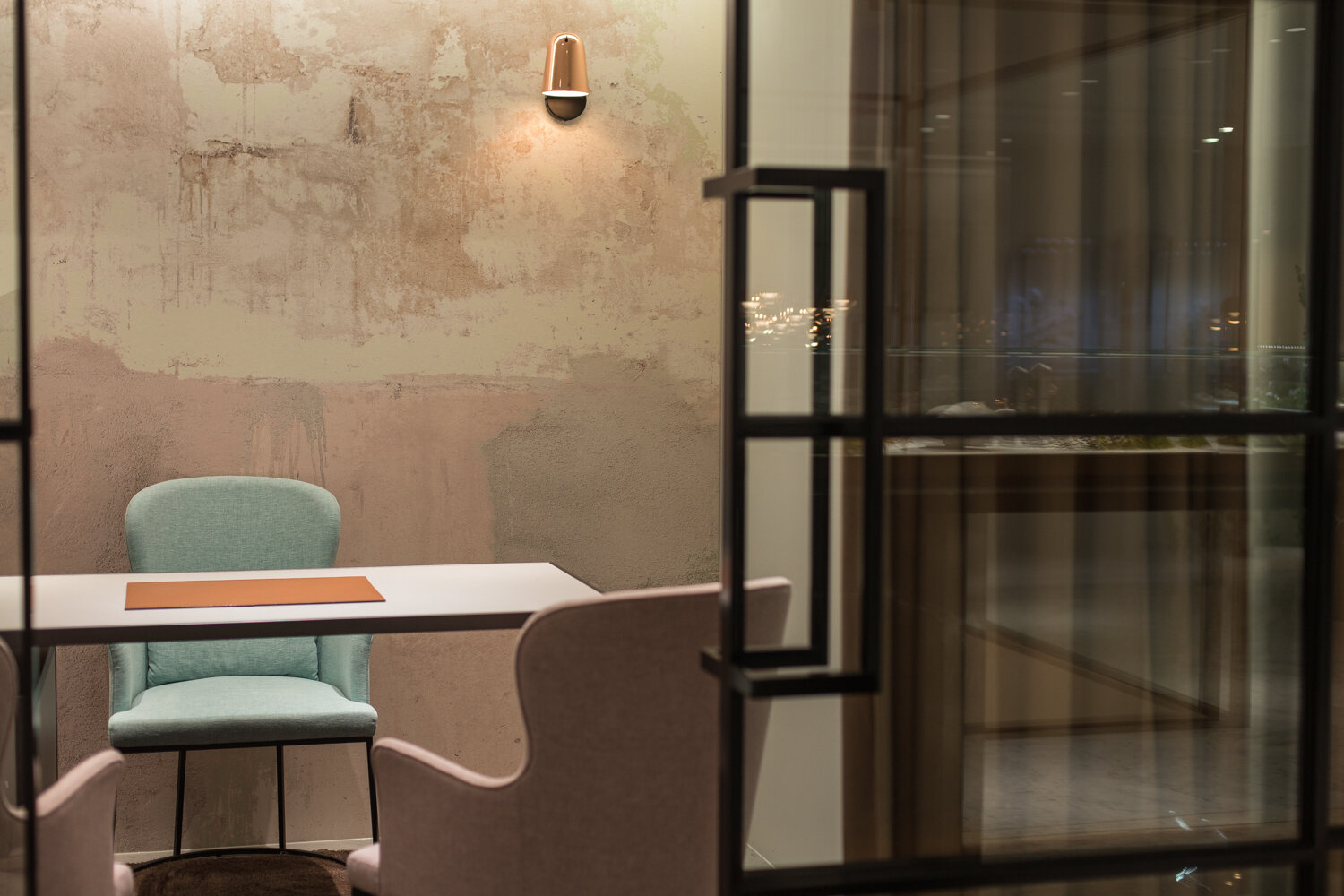
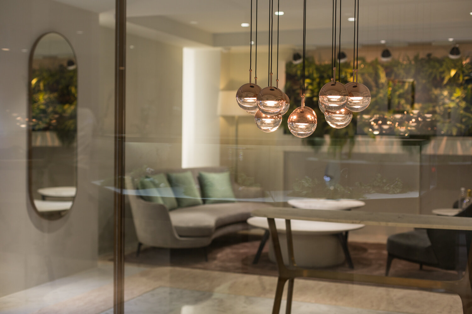
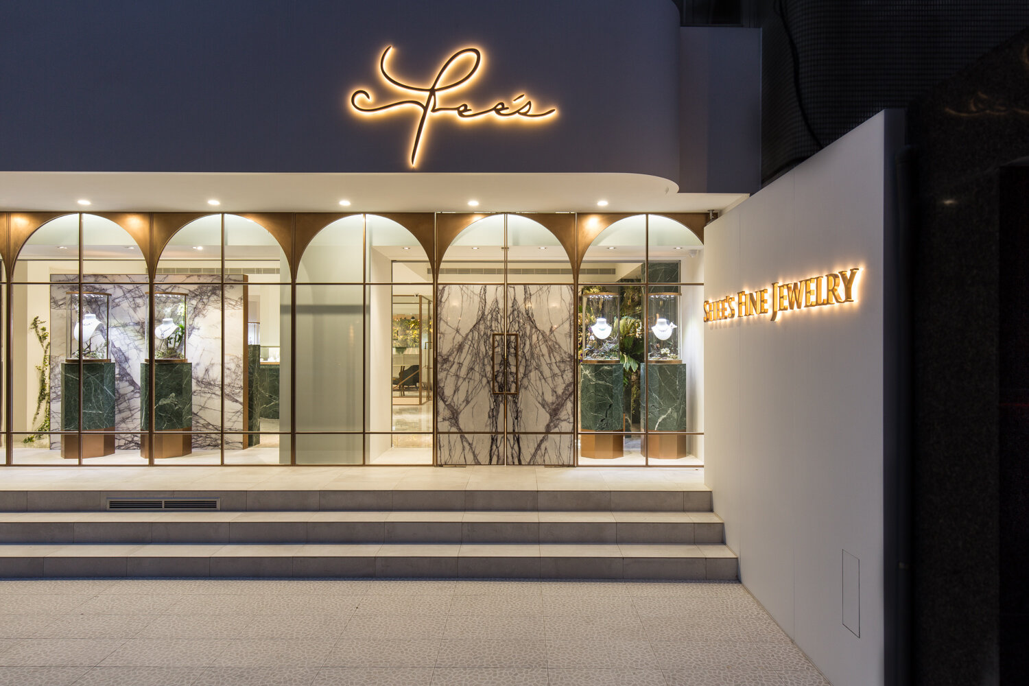
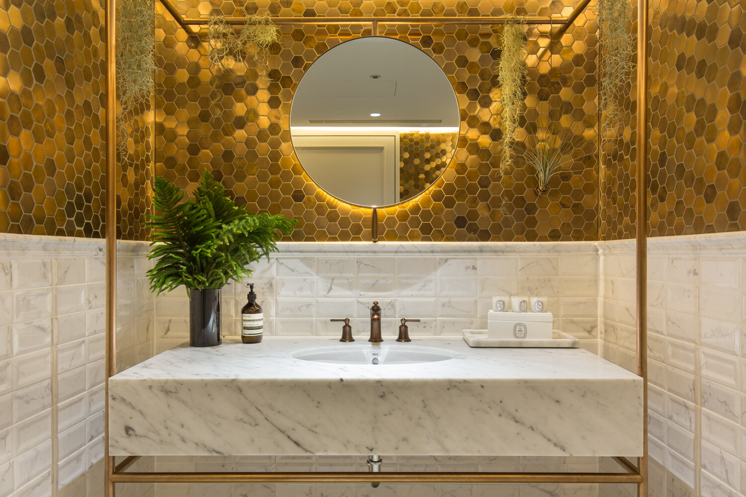
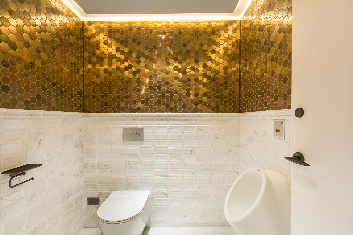
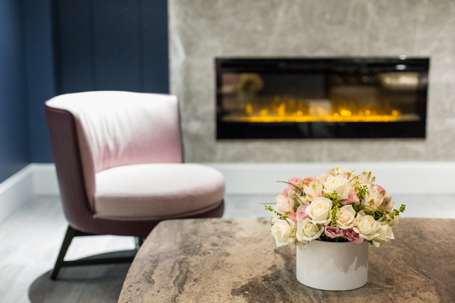
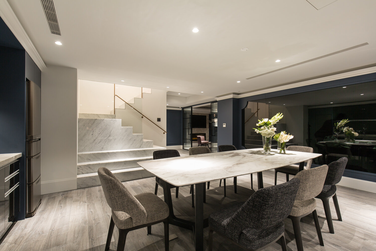
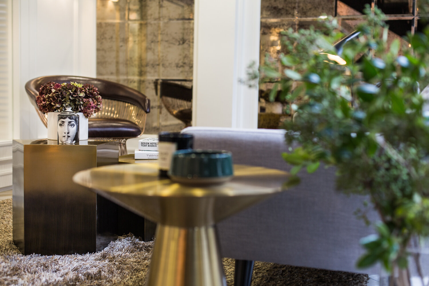
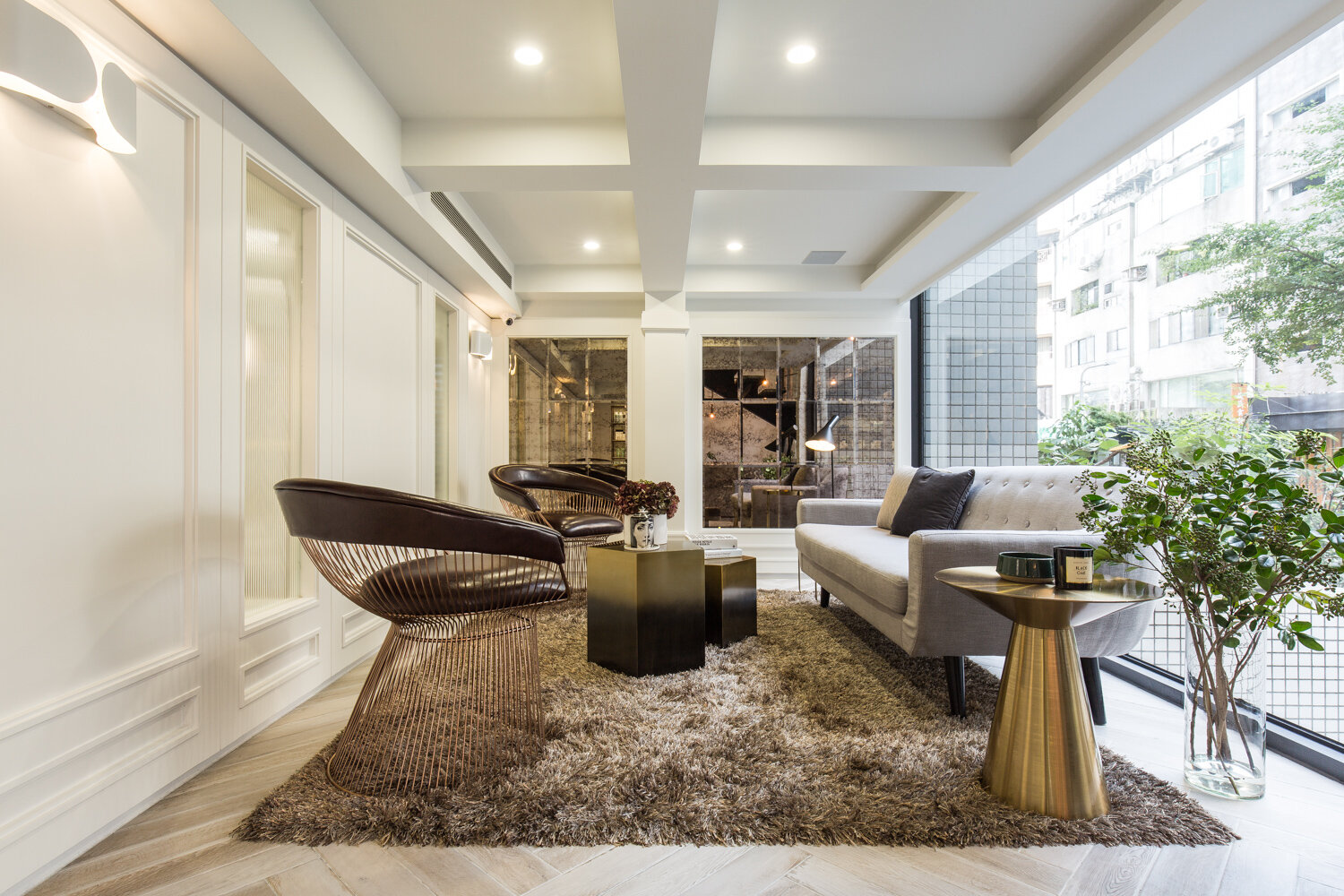
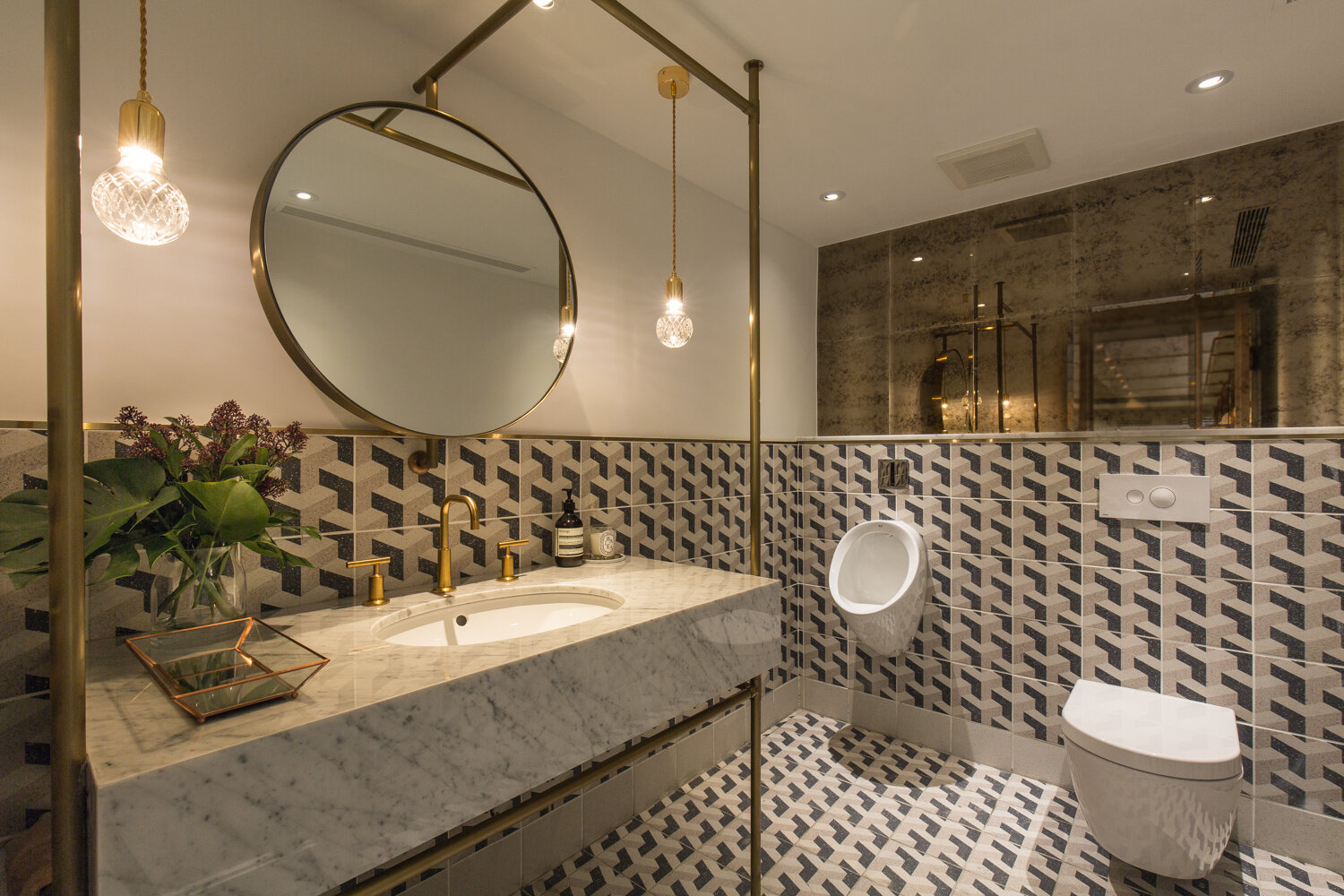
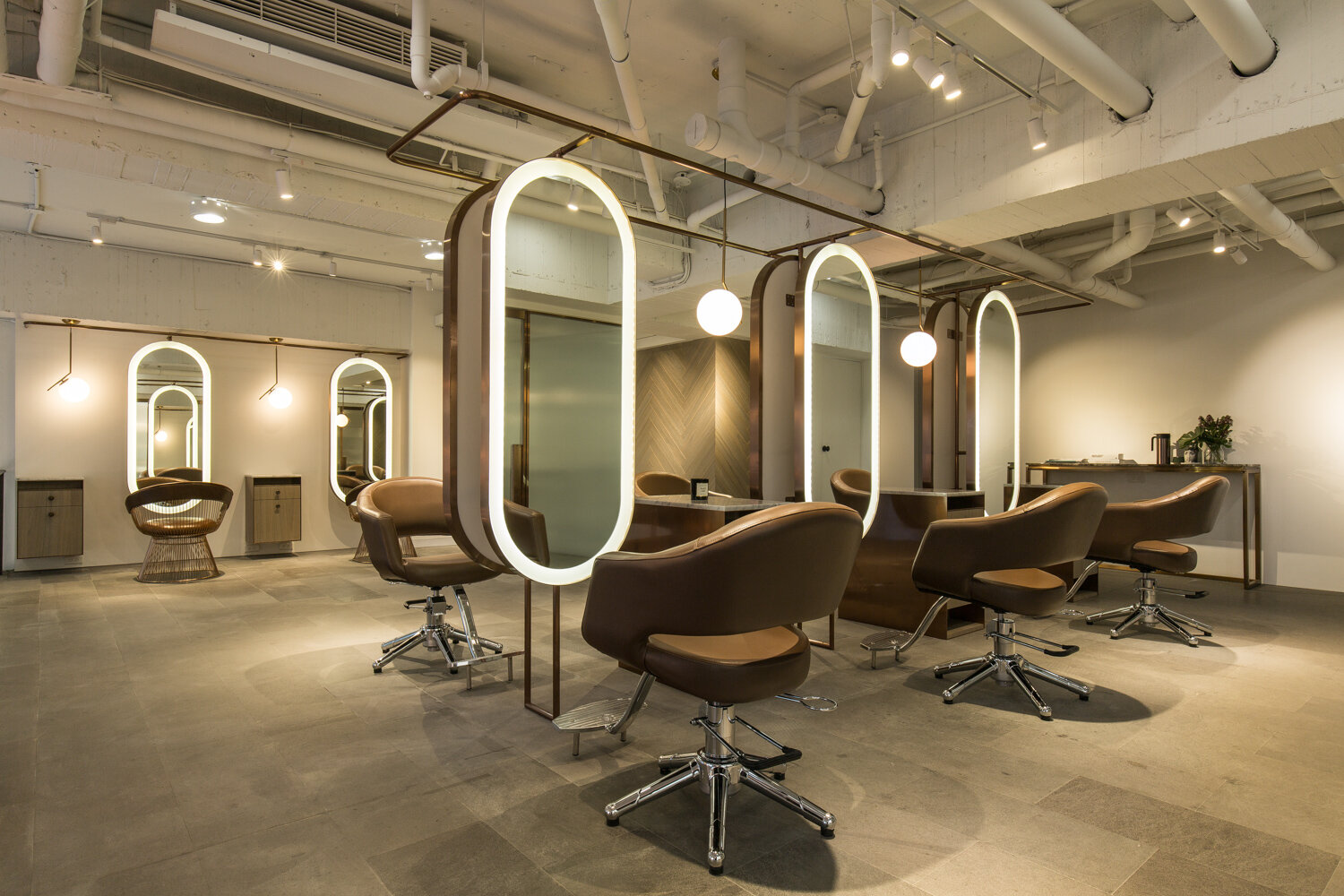
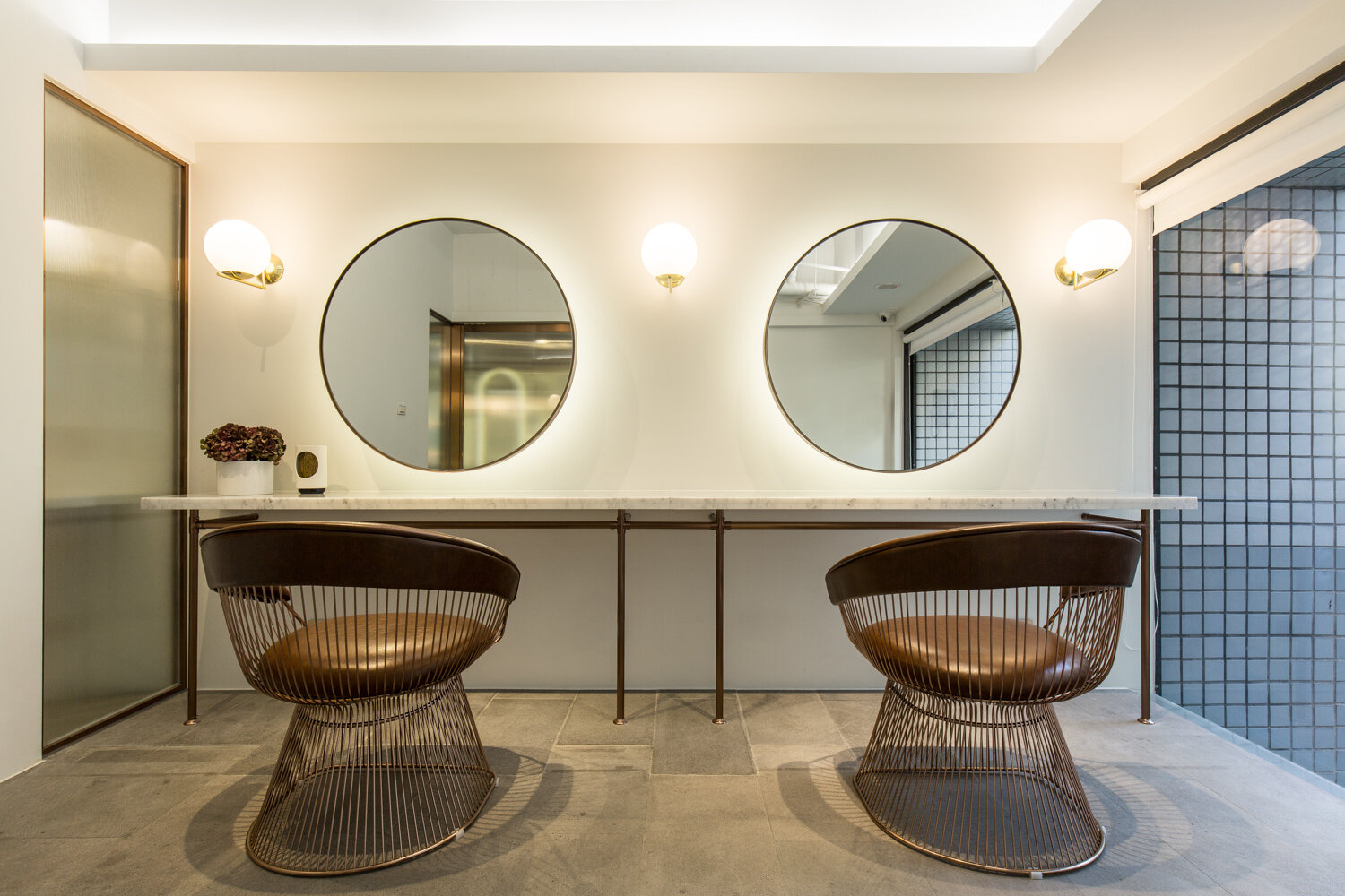
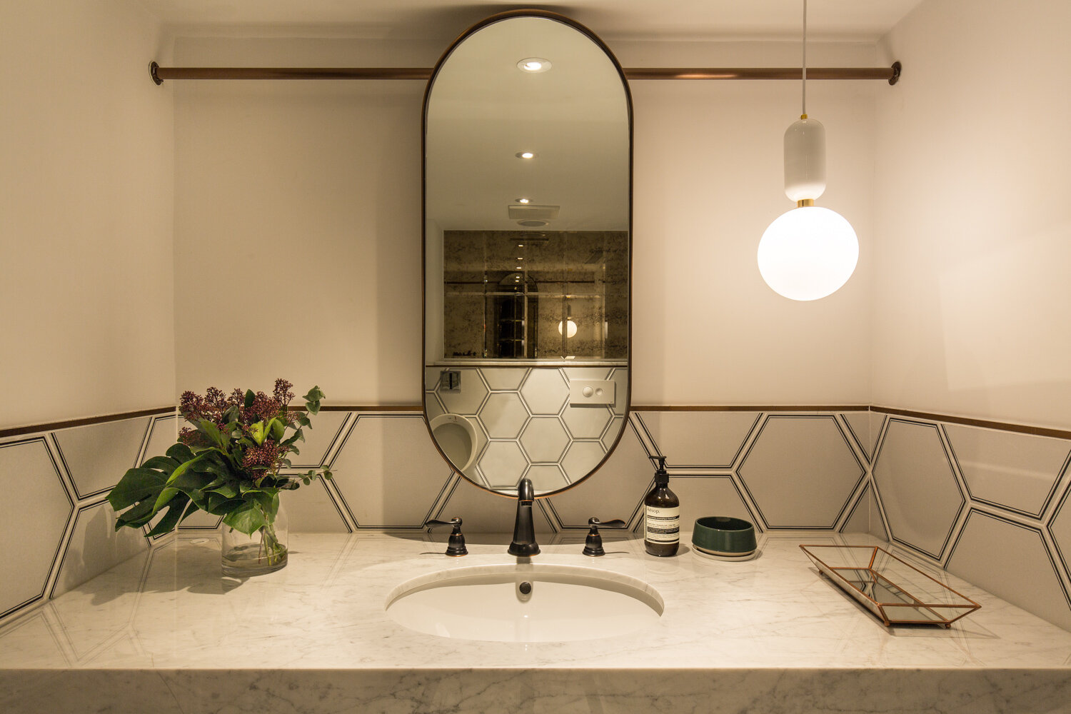
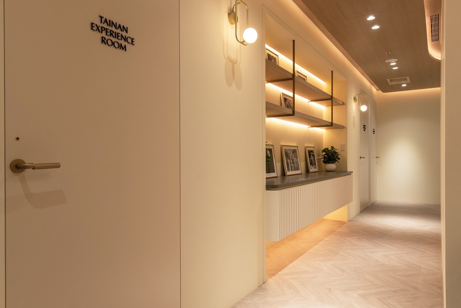
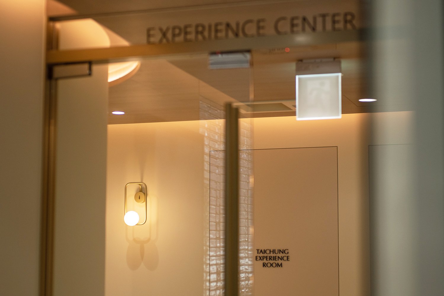
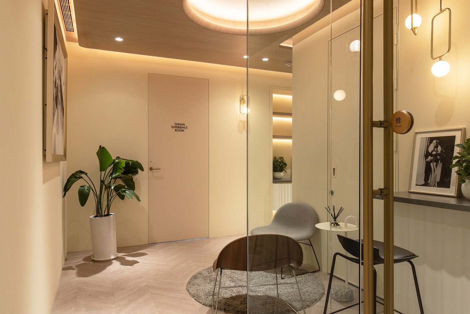
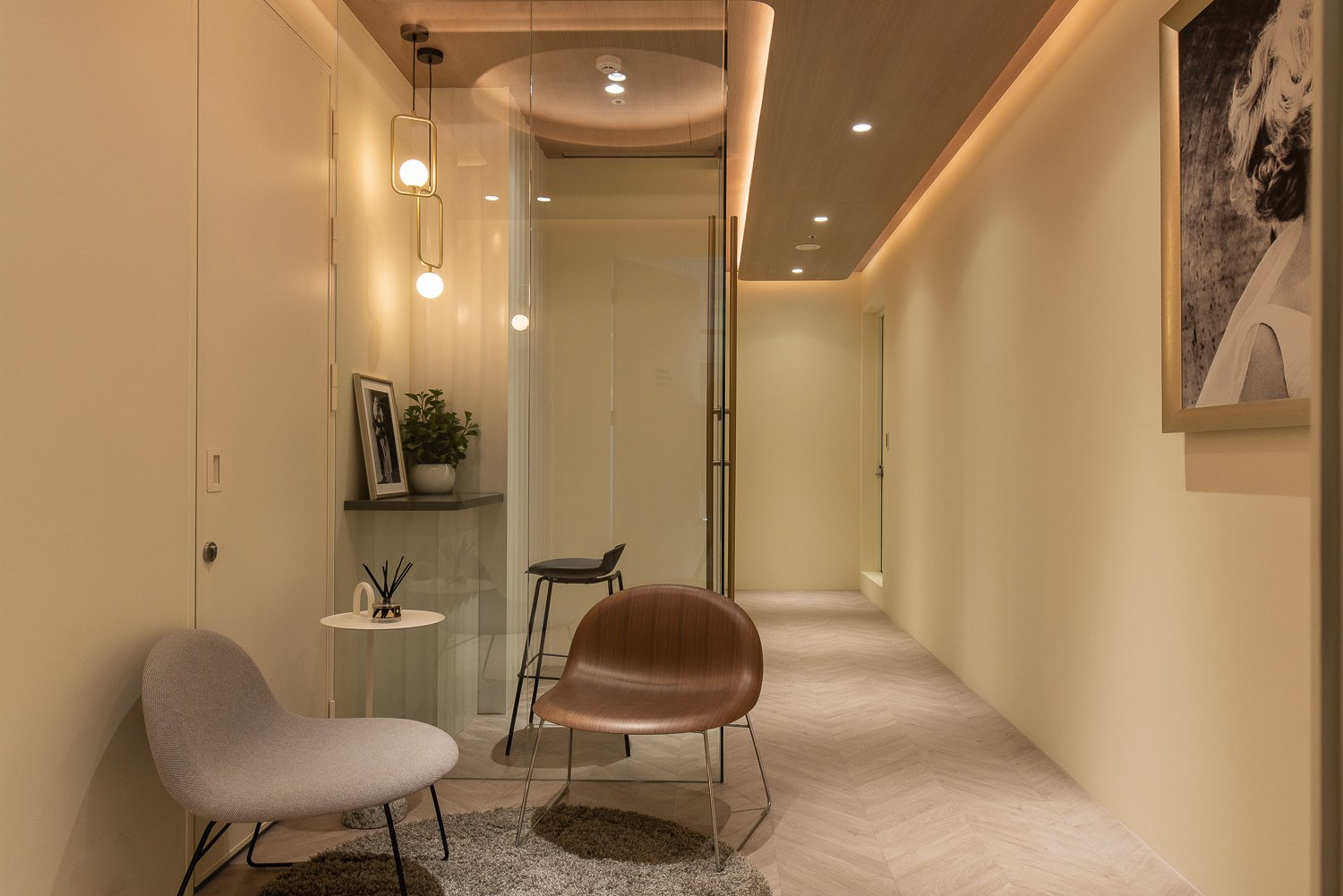
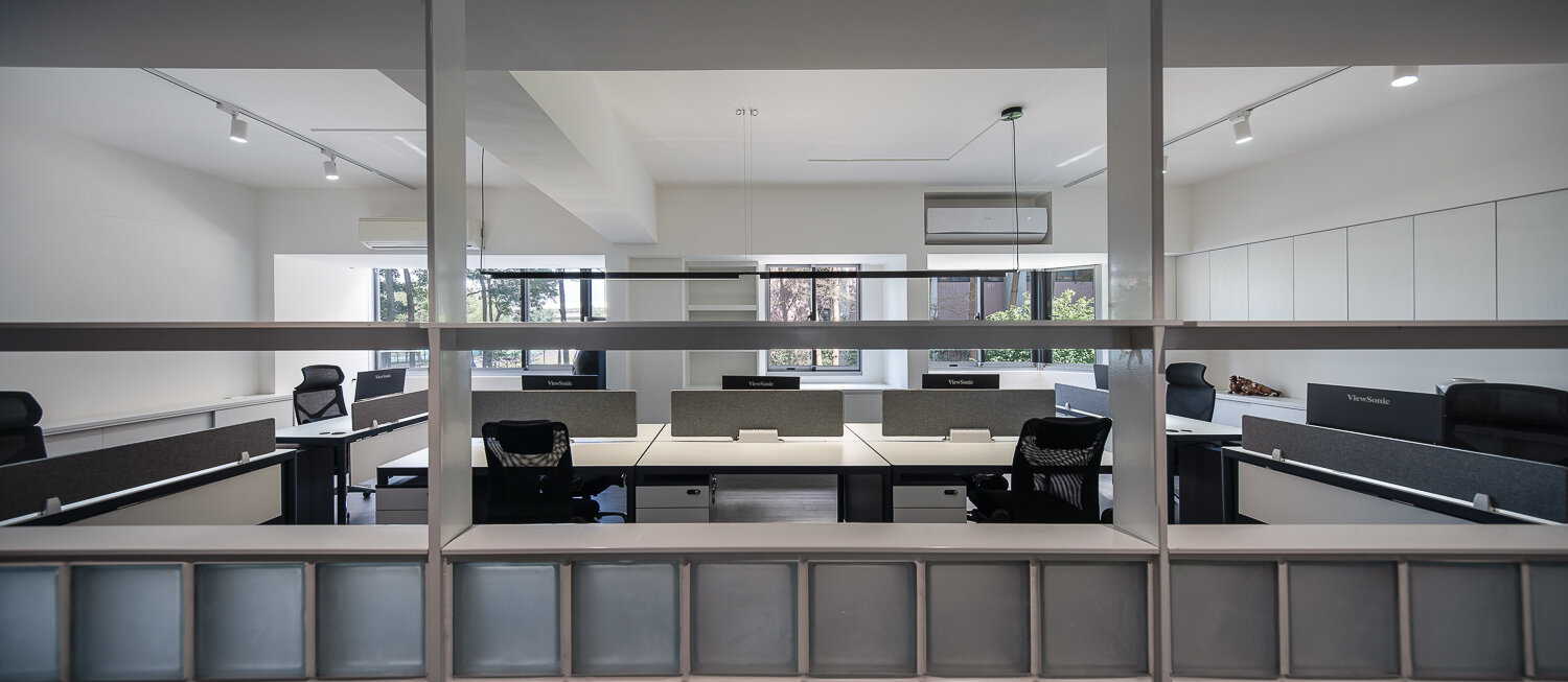
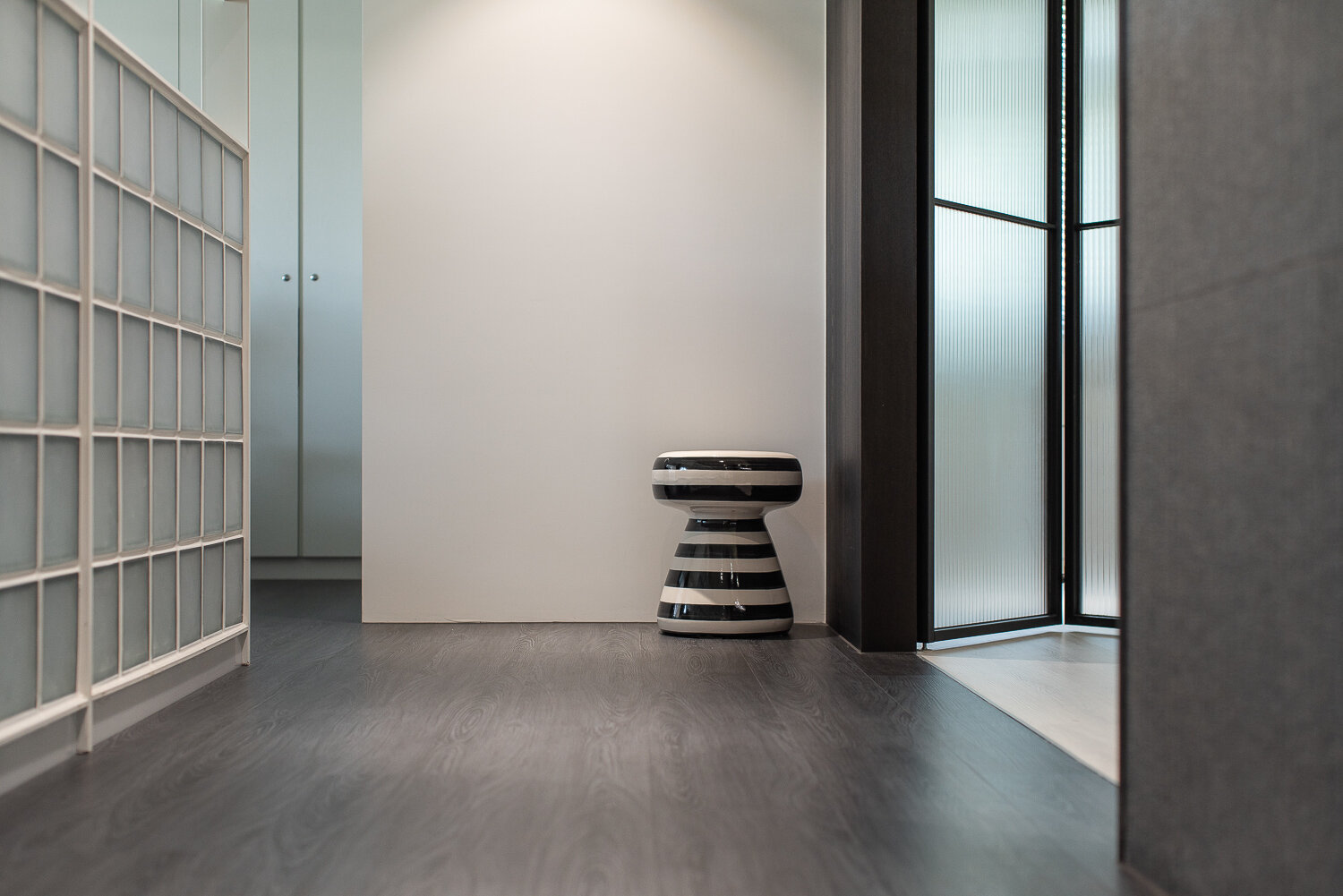
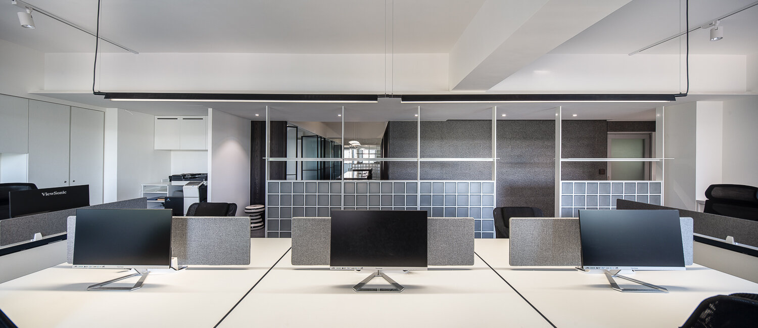
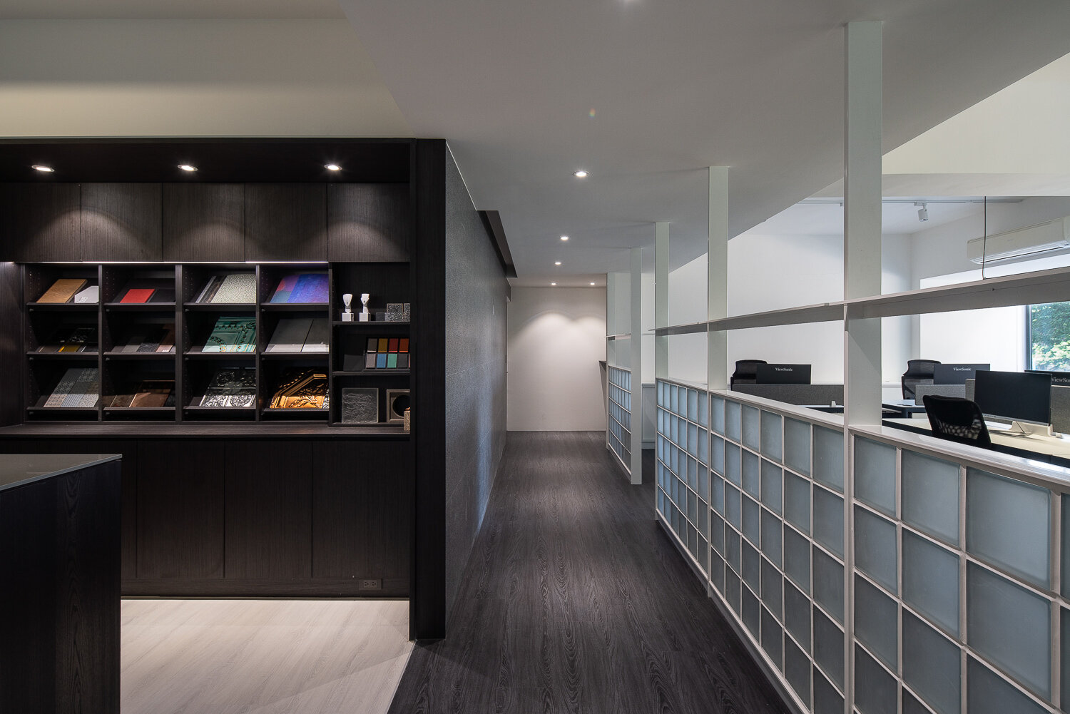
Breaking boundaries with fluid curves and refined harmony, this space reinterprets French medical aesthetics through a contemporary lens. Blending 70% modern minimalism with 30% French elegance, the design flows effortlessly through curved lines — from façade to ceiling to interior walls — creating a seamless transition from outside to in. A calm palette of cream and white, accented by earth tones and blue-grays, sets the tone for understated luxury. Stone, leather, titanium accents, and special imported wall coverings enrich the space with tactile and visual sophistication. Guided by light, the design celebrates the art of detail and soft beauty.

 
自然之美為設計意境 / 化繁為簡不規則的曲線 / 勾勒出空間的生命力

The beauty nature is the design conception , making the complicated simple Using irregular curve design techniques to symbolizing the life force of this space .


Making your inner beauty shines through


Founded with a strong belief in aesthetic design, FOUND HAIR creates a simple, elegant environment to provide authentic services using professional knowledge and techniques.


 Liberty 自由

我們去除現有建築框架,將各空間有效的釋放,可獨立存在亦可量體合而為一,放到極大值。

外觀以圓弧線條營造視覺延伸感,模糊了界線,將室內外空間顯得更具深度。色系大量使用淺色石子的紋理呈現,穿透性的設計也使得面相街道入口處有著良好採光,陳列架的虛實同時保有視覺的隱私感。

以入口動線為中軸劃分,左側以工作區使用機能歸整合併,更有將場域加以區分主外,空間中以不同的地坪質材以飽滿的圓弧線條劃分,天花板則融入簡單幾何形式的弧形線條,巧妙使得展示區、美髮區、VIP區塊安排的有所秩序,但彼此之間又連貫通透。

而雅致的大理石台作為視覺端景,增添空間的層次感,並以冷調的灰色為主,添上工業感金屬色系,自然皮革傢俱,來賦予空間獨特的性格,使它散發著迷人的光彩。

We removed the existing architectural framework to effectively free up each space, allowing them to exist independently or come together as a whole, maximizing their potential.

The exterior features curved lines to create a sense of visual extension, blurring the boundaries between indoor and outdoor spaces and giving them greater depth. The color scheme largely uses the texture of light-colored stones, and the design allows for good natural lighting at the street entrance, while maintaining visual privacy for the display shelves.

The entrance flow serves as the central axis, with the left side integrating and merging functional areas, further dividing the space into main and ancillary areas. Different flooring materials are used to divide the space with full curved lines, while the ceiling incorporates simple geometric arc lines, cleverly organizing the display area, hairdressing area, and VIP area in an orderly manner, yet maintaining coherence between them.

The elegant marble platform serves as a visual focal point, adding layers to the space. The main color scheme is cool gray, supplemented by industrial metal tones and natural leather furniture, giving the space a unique character and radiating charm.

 一次偶然的際遇有了La Pâtisserie P&D。二位大男孩,開始踏上法式甜點的道路.

挑高六米的空間很難讓人不多看它一眼,門面以低調確又醒目的設計讓人想進去一探究竟,白色為空間基調,黑、灰綠及鈦金色的搭配展現出清新脫俗的時尚感.好比法式甜點絕對注重外表的美感以精緻,細膩、情感豐富而取勝。

2F的用餐空間可以隱約窺見1F及室外公園,創造層次豐富的視覺饗宴。

P&D de patissier, a French pastry shop, came into being through a chance encounter. Two young men embarked on the path of French pastries.

The six-meter-high space is hard to ignore, with a facade that is understated yet eye-catching, inviting people to step inside and explore.The space is dominated by white, with accents of black, gray-green, and titanium gold, presenting a fresh and fashionable sense of sophistication. Just like French pastries, which focus on the beauty of their appearance, the design is exquisite, delicate, emotionally rich, and winsome.

The dining area on the second floor offers glimpses of the first floor and the outdoor park, creating a visually rich feast for the eyes.

STOP AND SMELL THE ROSES.. AN EXQUISITE LIFESTYLE

“ 精緻生活 ” 為出發的主概念空間以歐式 #慢時尚 精緻生活打造精細浪漫的氛圍,

慢活的優雅來自對細緻生活的要求...

結合了來自世界各地的新發現,期許你我於此空間打造屬於自己的精緻定位-


"Exquisite Living" is the main concept, with a focus on European #SlowFashion and creating a refined and romantic atmosphere.

The elegance of slow living comes from a demand for exquisite living...

Combining new discoveries from around the world, we hope to create a refined positioning that is unique to you and me in this space.

THE SPARKLE YOU ENVISION

作為原創珠寶設計品牌,SHEE’S FINE JEWELRY 帶領新式珠寶設計的潮流,將珍珠、鑽石與有色寶石年輕化,除了更適合日常配戴,也襯托出佩戴者出色的品味與個性。 其靈感汲取於對當代藝術以及珠寶工藝的熱愛,無外乎透露出她對於極致美感的追求以及品質的堅持,造就其作品的藝術性和豐富性。

 As an original jewelry design brand, SHEE'S FINE JEWELRY leads the trend of new jewelry design by rejuvenating pearls, diamonds, and colored gemstones. Apart from being more suitable for daily wear, it also highlights the wearer's excellent taste and personality. Inspired by a love for contemporary art and jewelry craftsmanship, SHEE'S FINE JEWELRY reveals her pursuit of ultimate beauty and her commitment to quality, creating the artistic and rich qualities of her works.

A matter of good taste

烹雪韻 Chá Noire 
以「分享純淨古法大樹茶」為使命。
乾隆皇帝「烹雪用前韻」詠讚普洱茶,
我們依循傳統不妥協的製程,
職人的製茶精神,來豐富茶品表現。
從新茶鮮醇到餘韻悠長,隨著時間的陳化,
風味一轉再轉地美好。
烹雪韻要把正宗百年大樹茶的與眾不同,
帶給愛喝茶的所有台灣人,
未來也帶給國際上同樣愛喝茶的人們,
這便是烹雪韻 Chá Noire 的創始初衷。

 
Chá Noire's mission is to "share the pure ancient tree tea." Following Emperor Qianlong's praise of Pu'er tea as "Chá Noire before snow," we adhere to the traditional uncompromising process and the spirit of craftsmanship to enrich the performance of our tea. From the fresh and mellow taste of new tea to the long-lasting aftertaste, the flavor transforms beautifully with time and aging. Chá Noire aims to bring the uniqueness of authentic century-old tree tea to all tea lovers in Taiwan, and in the future, to tea lovers internationally. This is the founding intention of Chá Noire.

Committed to create excellency

“創造美麗的事物是藝術行為之最佳實踐” 以時尚Salon的品牌核心所打造的新概念店,隱身在東區鬧中取靜巷弄內,大面積的使用落地窗讓光線充足流入,接待區挑高空間規劃也增加了視野開闊度,而從天花板向下垂降的燈飾更有如繁星點點照亮空間,如同思想、創意飛入天空一般。 使用了古典與現代的設計語彙,並結合了細膩的工藝傢俱、鏡台…等,勾勒出整體空間風格來呈現出品牌特性。

 
"Creating beautiful things is the best practice of art." This new concept store, built around the core of a fashionable salon brand, is tucked away in a quiet lane in the bustling Eastern District. Large floor-to-ceiling windows allow ample light to flow in, while the high-ceilinged reception area enhances the sense of spaciousness. The lights hanging from the ceiling, resembling stars, illuminate the space as if thoughts and creativity were soaring into the sky.

Combining classical and modern design elements with delicate craftsmanship in furniture and mirrors, the space delineates the brand's characteristics and presents a style that is both classical and contemporary.

原來最簡單的練習要能做到極致才是成功捷徑,

雅詩蘭黛位於大直的訓練教室 ,提供了一個舒適的環境供其旗下品牌人員研習肌膚護理、美研化妝常識及技巧。

空間的風格從女人角度延伸,從動線、材質或機能性,以及空間氛圍的營造,都增添細膩感,展現從容優雅的氣質~


"Sometimes, achieving perfection in the simplest practices is the shortcut to success. Estée Lauder's training classroom in Dazhi provides a comfortable environment for its brand personnel to study skincare, beauty, and makeup techniques.

The space's design extends from a feminine perspective, with details in circulation, materials, functionality, and atmosphere, adding a sense of delicacy and showcasing a graceful demeanor."


以 [墨線] 為設計出發點

由建築而生的空間場域,將不必要的裝飾褪卻忠實呈現空間模樣。

利用良好的舒適採光,保留原始建築平整天花板,及襯搭空間視覺純白色調,希望以開放的工作空間來創造寬闊感,並同時蘊藏充足的收納機能。材質上使用沉穩的黑色木皮,特殊鑿面石材,磨砂面空心磚來營造出空間層次感。

空間規劃上以主軸線來區分兩側空間功能,並運用穿透性的鐵件細柱分割線條來延伸視覺感。座位區安排在良好採光及有著窗外自然景致的位置,而上方原先突兀的大樑,以線型吊燈及白色調視覺來減弱存在感。

另一側開放式的材質陳列區域連結著會議室,空間尺度相當寬敝,以玻璃折門的方式可因應不同需求而靈活使用,營塑出多變表情與層次,創造出新的工作環境與輕鬆自在的工作氛圍。


Starting from the concept of "ink lines," this design aims to strip away unnecessary decorations and faithfully present the space as it is, born from architecture. Utilizing good natural lighting, the original flat ceiling of the building is preserved, complemented by a visual palette of pure white, creating an open work environment to enhance a sense of spaciousness while concealing ample storage functionality. Materials such as subdued black wood veneer, specially chiseled stone, and frosted hollow bricks are used to create a sense of depth in the space.

The space planning is divided into two functional sides along the main axis, using permeable iron columns to extend the visual sense and separate the lines. The seating area is placed in positions with good lighting and views of the natural scenery outside the windows. The previously obtrusive large beams above are softened with linear pendant lights and white tones.

On the other side, the open material display area is connected to the conference room. The space is spacious, and with the use of glass folding doors, it can be flexibly used to create a new work environment and a relaxed atmosphere.


We Do Spectacular Magus

[ 空間最美的風景,是人]

回歸空間的本質,重視材質真實面貌,以人為主軸。便是此辦公室設計案的概念。 空間經由粗曠材質與細緻線條互相搭配。水泥、鐵件、玻璃、開放式天花等元素來創造視覺畫面。 以回字型動線來界定各場域,並將採光窗景保留四週,透過「隱藏、開放、轉折」的空間節奏,構成人與人之間互動對話的美好關係。

 
The most beautiful scenery in a space is people. Returning to the essence of space, emphasizing the true appearance of materials, and placing people at the center is the concept of this office design. The space is created by combining rough materials with delicate lines, using elements such as concrete, iron pieces, glass, and open ceilings to create visual impact. Using a return-shaped flow to define each area and preserving the surrounding light through "hidden, open, and turning" space rhythms, it forms a beautiful relationship of interaction and dialogue between people.